15 of your Favourite Movie and TV Show Fonts Analysed
Have you ever noticed the dramatic impact different fonts have on the mood generated by the main screen titles of films and TV shows?
So much more than being just bland pieces of text, they are an intrinsic element of branding for the entire production. They should create a feeling that is complementary to the ones evoked by the content, and an impact that makes the title memorable and exciting.
Here we examine fifteen examples of well-known productions whose title fonts are worth commenting upon.

Harry Potter initially saw the light of day in 1997 with the publication of the first of a series of fantasy novels by Scottish author J. K. Rowling chronicling the development of the eponymous character and his classmates through a course of training at a school of wizardry called Hogwarts. The series was such a runaway success that film franchises and computer game adaptations followed within just a few years.
Graphic artists Miraphora Mina and Eduardo Lima created the graphic design of the entire Harry Potter universe, including book covers, newspapers and letters.
The essence of the Harry Potter logo lies in its font. There are no special symbols or other pieces of graphic design apart from the lettering. Its typeface includes a variety of recognisable visual characteristics that make it unique and highly distinctive.
The curved, sash-like cross to the initial H is suggestive of a degree of nimble, deft wand-waving artistry in Potter's antics; the forked stem of the P conjures a sense of the power to deliver lightning, reflecting the wizardry theme of Rowling's best-selling franchise; while the slender, stiff yet crooked hooked feet of the y and t are evocative of more devious manipulative powers, hinting at a darker side to goings-on within Hogwarts.
It is also noteworthy that the letters are set at different line heights, the progression through which from the start to end of the title follows a helter-skelter pattern of successive crests and falls. This creates a sense of exciting motion, action and dramatic contrast, evoking images of chases and confrontations during which evasive action is required, the exploration of secret places on multiple levels, and flying, all of which are elements featured in the films.

ESPN is a United States-based sports-focused cable television channel that was launched in September 1979.
The ESPN logo as it has been since 1985 was based on ideas found in the 1920 typeface by Aldo Novarese, Stop.
The graphic designer behind it felt that the break in the stem of the E was its most successful branding element. This was carried forward to the remaining letters to evoke a sense of motion and distance.
The italic slant is reminiscent of athletes leaning forward to run, the separation of the parts of the letters further evokes nimble-jointed athletic capability, and the red colour chosen for the logo hints at passions running high and hot action. The thick, regular, sturdy lettering is suggestive of the strength and muscular power of top sporting athletes.

That ’70s Show is an American television sitcom that was first screened between 1998 and 2006. It follows the lives of some teenagers who live in a fictional suburban town called Point Place, Wisconsin.
The font used in the TV series title resembles Arnold Boecklin Regular designed by Otto Weisert. Arnold Boecklin is a decorative font family meant for larger point sizes. It has an old world charm about it and positive associations with the American public's sense of 'the good old days'.
Its line strokes of irregular thickness and eccentrically curved appendages to some letters hint at good-humoured mischief of a kind that might be delivered with a conspiratorial wink in the eye.

Jurassic Park was originally a dystopian science fiction novel published in 1990. It developed into a series of highly successful films starting in 1993 and continuing periodically to be made to this day. The central theme revolves around cloned dinosaurs intended for use in a theme park escaping their keepers' control and wreaking havoc.
Professor Doug Olena created the distinctive family of fonts employed for the logo of the original 1993 episode.
Having come across a book of Art Deco alphabets, Olena set out to reproduce them in digital form. Every character, including punctuation, was separately created as a digital file, and these were then gathered to form the finished product of a complete typeface family.
The thick, solid but gently curving lettering evokes the monolithic strength and sinuous flexibility associated with dinosaurs, and a sense of awe is conveyed, combining excitement and fear.
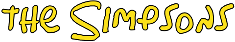
The Simpsons is an American animated TV sitcom series that has run continuously since its debut as an independent show in 1989. It satirically depicts the stereotypical middle class American lifestyle through the Simpson family.
The font shown here is the one used in the title of the show. The lettering used has been replicated in a complete font called Simpsonfont designed by Sharkshock. The font is available in capital letters, numbers and limited punctuation marks.
The broad, irregularly and carelessly formed letters mixing lower and upper case are suggestive of handwriting by an ill-educated, scatterbrained and zany individual, reflecting the characteristics given to the main characters in the show. Comic intent is readily apparent.
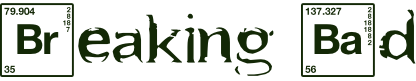
Breaking Bad is an American neo-western crime drama television series created and produced by Vince Gilligan. The show originally aired on the AMC network for five seasons, from January 20, 2008 to September 29, 2013.
The logo features symbols of the chemical elements Bromine and Barium from the Periodic Table. Barium is highly poisonous when dissolved in water, while bromine is extremely toxic to inhale. The featuring of two human poisons evokes an immediate sense of foul play and attempts at murder by sophisticated and devious means, in keeping with the crime theme of the series.
The main character Walter White is incidentally portrayed as a chemistry teacher with inoperable lung cancer, adding a further dark referential power to the use of these chemical symbols in the title. The disjointed combination of the symbols of the poisonous elements with rather broken-up letters in another font and at a lower line pitch hints at all not being well or straight with the world.
![]()
Transformers were a line of superhero-themed children's toys popularised by heavy advertising campaigns in the mid-1980s, each possessing the property of being able to be changed through manipulation of its joints between two quite distinct forms. The toys were so successful that cartoons based upon them were launched in their wake and screened on television. From 1986, full-length feature films followed. Comic book adaptations were produced by Marvel at various times, and the franchise continued to be intermittently active well into the 21st century.
The logo features a solid all-capitals typeface with square, regular joints and an even, thick width of line strokes throughout. Only the unexpected gaps in the A and R and the long, slanted tail strokes to the T and F hint at alien unconventionality and whimsy. Otherwise, the abiding impression is of exceptional toughness, power, strength and mechanical precision. Generally, the type is clean and easy-to-read, yet it has several elements making it unique and recognisable. Probably the most eccentric of them is the letter 'A', which resembles a triangle where one side is half-open.

The Godfather was originally a novel published in 1969, chronicling the saga of a mafia family. It was adapted into a series of successful and critically-acclaimed films starting in 1972.
Two of the central characters, family patriarch 'The Don' (the Godfather) and one of his sons, Michael, talk about not wanting to be a fool dancing on strings controlled by others. While they are contemptuous of the existing big shots or pezzonovante of society, both The Don and Michael exhibit a strong desire to become the supremo - the one pulling the strings behind the scenes and making others dance to his tune.
The Godfather himself possesses that kind of power, and the logo represents this symbolically with its tall, statuesque letters with solid, slightly elongated bases, indicative of prestige and towering strength. At the same time, the letters are closely packed together, evoking how the world of a mafia boss depends on close-knit relationships. The short side-strokes to the f and t suggest confinement and lack of freedom, secretiveness, and being huddled together for mutual protection and security. The elegant diagonals to the es and as and the tops of several letters exude Italianate style, class and sophistication, qualities to which the family at the centre of the saga surely aspires. The top stroke of the G extending over two other letters and almost forming a loop with the downstroke of the 'd' emphasises how far-reaching the power of The Don really is. He can raise a finger, and get people at some distance to do his bidding.

Shrek was a picture-book produced by veteran American cartoonist William Steig in 1990. It was adapted into a computer-animated movie first screened in 2001, and this in turn has spawned several sequels.
The central character is a green ogre calked Shrek. Discovers that his swamp has been overrun with assorted mythical creatures thanks to his scheming antagonist Lord Farquaad, Shrek embarks on a journey, accompanied by a noisy donkey, in a bid to persuade Farquaad to return the swamp to him.
The thick but variable-width strikes of the component letters of the Shrek logo are reminiscent of the strong but soft-hearted and somewhat plump creature that Shrek is. The more delicate and incongruously lower-case 'e' especially hints at a layer of vulnerability beneath the outer body armour. The logo is finished in the character's skin colour, the 'S' even bears his horns, and the 'K' has been fitted with a sort of stubby tail for good measure. The overall effect is to make one think of a fantastic beast with Shrek's kind of appearance, and to feel sympathy and liking for his cuteness rather than horror or revulsion, reinforcing brand recognition for and positive public sentiments towards the franchise.

Pirates of the Caribbean is a series of films having unusual origins in a much earlier water-based theme park ride opened at Disneyland in 1967 and since reproduced at several other Disney theme park venues. The first film did not appear before 2003, but the series has been such a box office hit that four more have already been published and a sixth is planned. Those released to date are subtitled The Curse of the Black Pearl, Dead Man’s Chest, At World’s End, On Stranger Tides and Dead Men Tell No Tales.
The title of the films is set in a Gothic-style font, a good stylistic match for an historical fantasy theme set around piracy. Gothic fonts are generally suggestive of historical themes that include somewhat macabre elements. This probably stems back to the gothic novel genre popularised in the late 18th century, which tends to include elements of horror, and also separately to the medieval origins of Gothic architecture. Pirate novels have traditionally been set in the late 17th and early 18th centuries.
A font designer codenamed Mseek has adapted the film title font into a complete downloadable one variously called Caribbean or Caribbean Island.
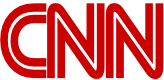
CNN stands for Cable News Network, and is an American television news channel launched in 1980 and widely watched to this day.
The CNN logo was designed in 1980 and was created in fewer than 48 hours. It is virtually unchanged thirty-seven years later, although it is sometimes varied, occasionally being found with joined-up letters or animated.
The abiding sense from the lettering is regularity of form but with pleasantly rounded corners. This could be seen as indicative of a message of trustworthy, reliable yet refined and smoothly presented reporting.
The striking visual contrast between the thick red outer walls and narrow white inner core of each letter has more of a dramatic ring about it, as though to suggest that the channel is quick to get to the action, hot off the press, and not afraid to report on highly sensitive topics and show viewers the underlying facts beneath the smoke and heat generated around controversial events.

Frozen is a name common to several high-profile films released around the world, but the one this title logo refers to is a computer-animated Disney movie released in 2013.
The action teams indomitable optimist Anna with rugged man of the mountains Kristoff and his loyal reindeer Sven. Together, they embark upon an epic journey to find Anna's sister Elsa, whose icy powers have trapped the kingdom of Arendelle in eternal winter.
The title font has noticeably jagged edges, like brittle, jagged pieces of the ice that forms such a prominent element in the setting and narrative. At the same time, the diagonal strokes of the R, O, Z and N show a curvature and malleability that belies the solid crystalline structure of ice and hints at powerful elemental or darker forces able to distort and shape the world.
The 'O' in particular curves inwards at the point where the two ends of the circular stroke by which the letter is normally formed should tie up, as though bowing under immense pressure or blown aside by winds of great magnitude. The letter as a whole even bears passing resemblance to the effect of a whirlwind. Magical forces are implicit, and an air of suspenseful mystery is effectively conveyed even before the viewer comes to watch the action.
![]()
The Amazing Spider-Man is a 2012 American superhero film based on the Marvel Comics character Spider-Man, which first appeared in 1962 in comic strip format and was initially adapted for an animated TV series running between 1967 and 1970, this being the first of many screen appearances, mostly in animated serial format. The first standalone Spider-Man film was released in 2002, and The Amazing Spider-Man was the fourth of these. The motion picture shares the title of the character’s longest-running comic book.
The slanted red letters hint at Spider-Man's athletic agility, while the virtual absence of spaces between them evokes his uncanny ability to cling to buildings. The regular, square strokes to the letters could be suggestive of news bulletins being produced in a hurry in print media, like the reports on the action in which the character gets involved. But it also highlights his extraordinary strength, bravery and unflappability in the face of mortal peril, and fame.
A couple of the letters, the D and R, exhibit slight breaks where the strokes do not meet. This suggests that Spider-Man is not totally predictable or ordinary, and can make use of loose joints where needed to accomplish his feats of action.
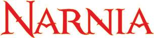
The Chronicles of Narnia is a series of seven best-selling children's novels by Christian theologist C. S. Lewis, published between 1950 and 1956.
The series mainly tells the adventure story of children in the fictional world of Narnia, under the guidance of Aslan, a talking lion who is also the king of Narnia and is said to represent Jesus Christ.
It was initially adapted for television in the UK in a succession of multi-part series screened between 1988 and 1990, before being recreated for the big screen starting in 2005. It is the more recent movie franchise that features the logo shown above. So far, just three of the seven novels have been recreated as films. A fourth, 'The Silver Chair', is expected to commence filming in late 2018.
The font has been reproduced and extended into a complete font by Bajo La Luna Producciones as Narnia Bll. You can download this font for free below.
The brush strokes are of variable width and tapered or extended at their ends and sometimes, to unorthodox visual effect, at their middles. This irregularity combines to create a sense of unpredictability and a slightly gothic feeling of magic afoot. The sweeping curves of the R are suggestive of great and well-honed magical power or artistry. The cross strokes of the A are highly unusual, evoking the silhouette of a bird soaring through a narrow archway or attempting to but jammed at its wings, the scope of possible symbolic value of which is virtually as boundless as the imagination.
In all, the font plays with and stirs the imagination of the reader by design, at the same time as disturbing any sense of normality or the ordinary - a sound preparation for a truly magical set of tales.

Knight Rider is an American television series created and produced by Glen A. Larson. Originally broadcast on NBC from 1982 to 1986, it was exported internationally to the UK and other countries. The show stars David Hasselhoff as senior police detective Michael Knight. A central supporting character is Knight's advanced artificially intelligent car KITT.
The screen title exhibits proud, mostly regular tall, thick lettering, but the tapered feet of the N, H and Rs depart from the lower line within which all the other letters are set, and hint at the special abilities and powers with which Knight, when assisted by Kitt, is armed. The wide spacing of the letters creates a sense of freedom befitting Knight's character and life chasing villains on the road; the broadened tops and tails of the letters indicate pride and acclaim; while the quirkier elements are a good match for Knight's well-honed 'cool' image.
A font can really make or break a brand and the same considerations should be made for your logo. All of these graphics, along with colours and tone, come together make your brand guidelines. These are the guidelines you will use to inform brand decision going forward. If you this something you feel you brand or business could use some help on, we’d be happy to help. We offer Branding and Corporate Identity Design, which covers brand guideline creation. Get in touch here to discuss your project.