The announcement of the change to the Starbucks logo, and the outrage it has sparked, this week got us thinking about some of the issues that often crop up with rebranding.
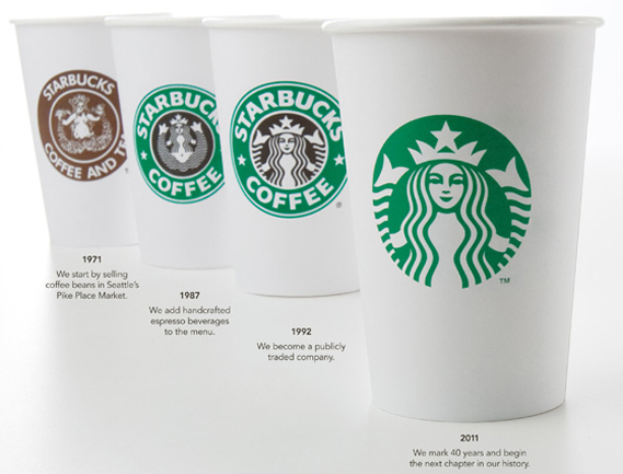
The design change to the Starbucks' logo, which involves a dramatic streamline but retains its core principals (colour and image), is intended to reflect the company's shift towards non-coffee products, which it plans to sell more of in the future.
An interesting point raised on Creative Review's blog is that the brand has been presented on an object (the paper cup), rather than in abstraction.
While many have vocally resisted the removal of the text, it would be difficult to argue that such an iconic image doesn't immediately bring Starbucks to mind.
When a brand has achieved the kind of global dominance that Starbucks has, there is less need to provide the consumer with textual signposts.
In one of our round-ups last year we featured this 'Name that Brand' game, which shows how surprisingly easy it is to identify famous brands simply from looking at their logo colours.
Imagery and colour can often speak louder than words.
| Gap's proposed new logo |
One thing's for certain, the change hasn't yeat provoked the kind of outcry that accompanied Gap's attempted logo change last year.
Although the company tried to deal with the backlash humorously, by creating a dedicated @gaplogo twitter account, public opinion wore them down and effectively prevented this from being introduced.
While Gap's logo represented a radical rebranding of the company, Starbucks' re-design should be thought of as a deliberate attempt to streamline the existing image - an approach similar to that adopted by MTV last year.
Another major company which introduced a rebranding last year was high-street booksellers Waterstone's.
Their change of 'W' was also unpopular (as you can see from the comments on the Creative Review's blog, which also presents a very interesting analysis of the new 'W' versus the old).
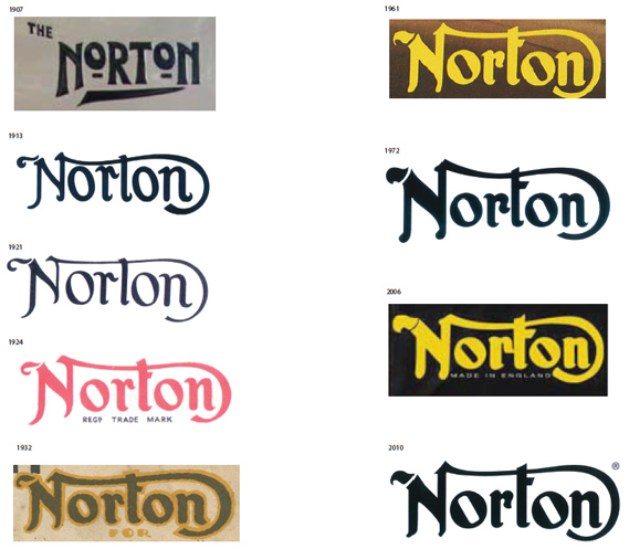
However, many re-designs are received more positively, for example this celebration of the evolution of Norton Motorcycle's logo from 1907-2010.
There is a strong argument when redesigning a logo with good recognition and awareness in its target markets for avoiding radical change.
If you have good brand awareness, you can maintain that by respecting the basic integrity of the design (unlike the new Gap logo which only kept a small square of blue, or Waterstone's new 'W' which utilises an entirely different font), and present an evolution rather than overhaul.
| Waterstone's new 'W' |
An interesting aspect of the response to these re-designs is the emotive nature that shapes, letters and colours have on the consumer, and how specifically design can communicate something very central to the company.
(Click here for a humorous timeline of future re-designs of the Starbucks logo.)
Reactions to the new Waterstone's 'W' accused it of looking less classy, and Creative Review attributed an austere confidence to the old 'W', which it associated with looking 'like it remembered what bookshops used to be about'.
Another useful lesson from these case studies is to think very carefully about where the logo will be.
Starbucks have presented theirs already on a cup, which shows how well it fits into that use.
Many felt that the Waterstone's new 'W' looked like a response to the company's online presence, rather than one focusing on the shops themselves.
Logo design is an important aspect of our work as designers, and plays a crucial role in the look of a website (as we discussed in our post on the re-design of Mensa International's site).
This is a subject we will be returning to in future posts on branding and website design.
In the meantime, lets us know what you think about these different rebranding strategies and what makes them succeed or fail.