CTAs or calls-to-action are a marketing tool that can be used on a web page, within an email marketing campaign, in an advertisement, or in any other piece of content that will be directed at users or customers.
CTAs can be used across your site and other promotional materials, but, in this article, we are primarily considering calls to action on web pages.
The purpose of a call to action is to elicit an action from the viewer. They are intended to stand out and effectively communicate with the user, signposting them to the next step you’d like them to take – whether that is providing their contact details, becoming a customer, subscribing to a newsletter or social media channel, signing up for a membership, making a donation, or even putting their name on an online petition. Any one of these goals may be defined by the content creator as a conversion.
When implemented successfully, CTAs can be a powerful way to increase conversions and accelerate the capture of new sales and leads. In this article, we look at ten best practice guidelines to consider when designing your CTAs.

1. Make it readable and clear
The point of a call-to-action button is to encourage your user or reader to take their next step. For this, the text within the call-to-action will need to be readable and clear. Think about the font you use, its size, its formatting (whether bold or italic), and if the text should be in capitals or lower case.
When designing, you should try out different variations so you can easily see which is the most readable on the medium for which it will be used. At this point, it may be worth asking a colleague for their thoughts and feedback, as it is good to get a second opinion. Fresh eyes are always helpful to give a different perspective.
In the above example, Finisterre have done a great job of making their CTAs clear. Whilst the background video plays, the button colour is visible throughout and the black text on the button grabs your attention enticing you to click.

2. Is it relevant?
Ensure that the action you are directing the user to take makes sense to them and is relevant to the page they are looking at. If the action is unrelated or doesn’t seem logical, it is less likely that the user will follow the CTA.
Users want a site that they can use with ease, and one that is simple to follow. Confusing them with a site page that references one topic or service but contains a CTA that is unrelated to that is likely to make them feel that they have reached a dead end or that you are cross-selling to them something they don’t want. This can damage their trust in your brand and will reduce the chance that they will proceed to get in touch or a make a purchase.
The Arnolfini are highlighting a future exhibition in the image above. We can see that the CTAs are completely relevant as they offer the chance to find out more about the exhibition or to go ahead and book.

3. Direct with action words
You want the user to take direct action, so choose your words carefully. Rather than simply having one or two words on your call-to-action, such as ‘INFOGRAPHIC HERE’, use words that specifically tell the user of the action you want them to take, such as ‘DOWNLOAD YOUR INFOGRAPHIC HERE’.
Giving a more direct instruction as opposed to a more generalised comment gives the user a firm sense of what you’d like them to do and makes them feel as though you are communicating with them clearly and personally, increasing their confidence and engagement with your site.
We can see clearly in the example above that (like in our example) the action word ‘download’ is used. Here a free chapter of a book is being offered to tempt the user into buying the complete book once they have read the free chapter. The action word here works perfectly for the purpose.
4. Stick to short and sweet
Whilst it’s great practice to include action words, be sparing in your word count for your CTA. The use of too many words may run the risk of the button beginning to look less like a button and more like a heading within a box.
Keep it simple with between two and five words, so the direction is clear and you can get your point across quickly. It needs to be a short, quick instruction so the action is taken almost as a reflex rather than the user having to digest a large chunk of text or information and have time to consider what they do next, including the possibility of taking no action at all.
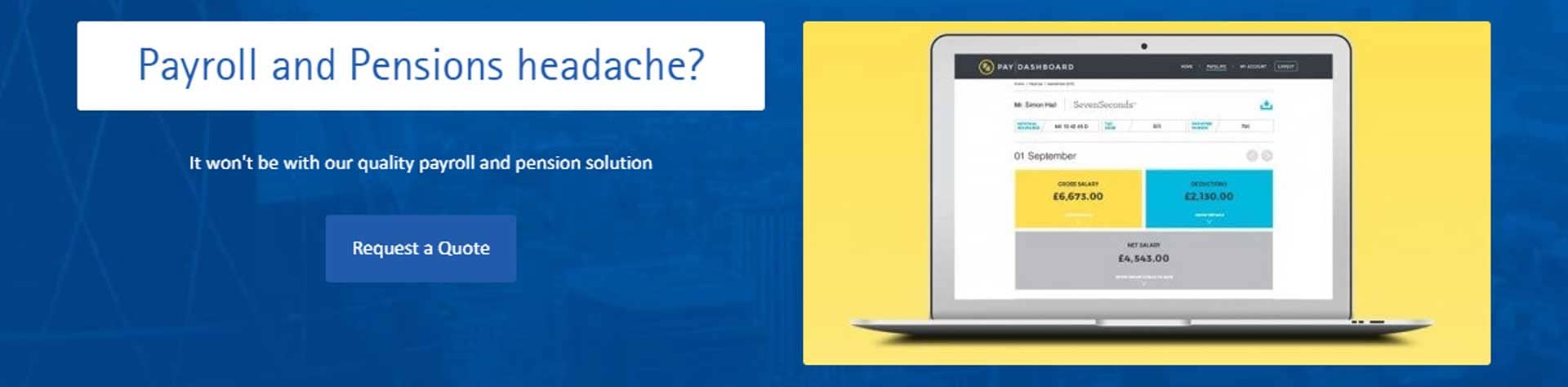
Looking to the above image, BookCheck have stuck to the ‘short and sweet’ option with just ‘Request a Quote’ as their CTA, nothing too in-depth or fussy, just a simple instruction for the user to follow. The user doesn’t need to spend much time reading and thinking about what their next action should be. They can simply hit the button for a quote.

5. Is it useful?
The best CTAs are the ones that are truly useful to the user. How can you help the user and direct them to what they are looking for? CTAs are a marketing tool, but that doesn’t mean that their aim can’t be to help the user on their journey.
If you can make the process a good experience, not only do you stand to make a sale or gain a lead, but you have the added bonus that the user is likely to see the website in a favourable light, come back again, or even recommend it to others.
The CTA featured on the Trello website makes sense for the user, as to begin using and trying out Trello you have to sign up and make an account. Once the user has read enough about the productivity tool and has decided they would like to try it, setting up an account to this end would be their obvious next step. Trello also offer the option of ‘Watch video’, perhaps in case at this point the user is not 100% certain whether they would like to offer up their email and create an account. An informative video might just nudge them in the right direction.
6. Make it urgent
Adding a sense of urgency can increase the likelihood of the user taking the action in the moment. If they feel like they are in danger of missing out on a free download or a limited-time discount offer, they will be more likely to follow through and complete the step immediately.
To do this, you can try including words like, ‘now’ or ‘today only’, to emphasize that this will only be available for a limited time period. Some websites even implement countdown timers to the end of a special offer to heighten the sense of urgency, or present the offer as a ‘now or never’ opportunity, adding that if you navigate away from the page, it will never be repeated. This tactic is more commonly seen on long-form sales pages, and might not work with every audience, so don’t go overboard with it.
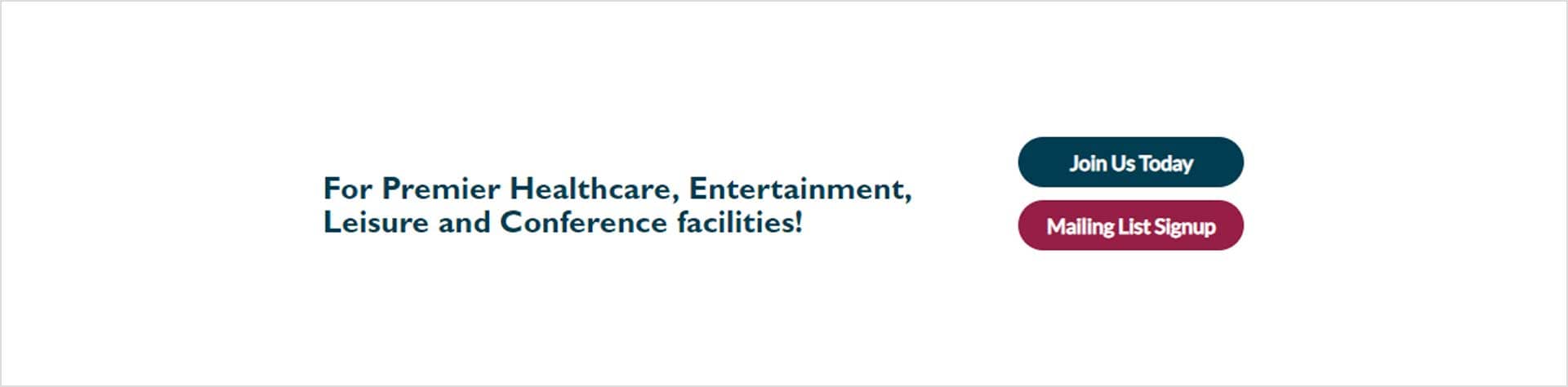
‘Join Us Today’ is the CTA that BAWA have chosen, and it adds an element of urgency, proposing that the user should take the step today rather than waiting. We prefer this hint of urgency, but you will have to see what works with your audience. Too much may turn people off.

7. Use colour
Colour can be emotive, but choosing the correct colour for the action you want the user to take can be tricky. What colour feels right for the action? For example, the colour red can evoke feelings of love or anger, and the colour yellow can evoke feelings of happiness.
Do your own research into the colour you think might work best to avoid any unexpected connotations. Also, keep in mind your own brand guidelines and the associated colour palette, as your CTA could look out of place if you choose a colour that is completely unrelated to your branding.
Mailchimp have chosen yellow as the colour of their ‘Sign Up’ button. Not only is this colour on-brand for Mailchimp, but it has connotations of lightheartedness, which again aligns with the brand and makes the button seem more like a helpful direction than an aggressive one.

8. Place it front and centre
Ensure that your CTA is immediately visible when someone enters your site or page. Your user wants as seamless an experience as possible; and if there isn’t an obvious next step to take when entering your web page, they may well navigate away from it soon after.
You can’t guarantee that a user will scroll down the page they land on, so keeping your CTA above the fold will increase the chances of it being seen and clicked. It will be instantly obvious for the user to see the next action you would like them to take. If your page is a longer one, however, then in case the user does continue down it, it is good practice to provide additional CTAs further down the page too, including one right at the bottom of the main text area, though above the footer.
‘View Our Washing Machines’ is the CTA featured on the Brewer and Bunney website. This CTA is placed above the fold and is visible immediately after landing on the page. This is also part of a sliding widget which hosts other items and CTAs Brewer and Bunney would like to highlight.

9. Make use of white space
White space can be a super-simple way to make your CTA stand out on what could potentially be a busy web page. White space included around your CTA can act almost as a border that will help get your users’ attention.
Too much busy content on the page will distract the user, which could make them unsure as to which step they ought to take next. Make it as easy as possible for them to take the one you would like them to, by making sure there is enough white space to make it stand out clearly.
Hubspot have used white space in the example above to make sure their CTAs have the maximum impact. Your eye is straight away drawn to the bold orange colour, tempting you to click.

10. Test, test, test
As with all marketing activity, the best way to predict how successful it will be is to test, test, and test again. Navigate the user journey yourself, and make notes on how easy it is to see, read and follow the directions from the CTA. Ask colleagues to do the same, and request their feedback. Do they think the colours are appropriate for the use? Does the wording resonate with them?
You can also test the CTA in situ if you can’t quite decide on such attributes as colours, font or styling. Start by setting it up one way on the site and letting real users experience that journey. Test this option for a week or two (or possibly a month or two if the page in question gets a lower rate of usage and you therefore need longer to assess the impact in a statistically reliable fashion), and then change it to your second option, leaving this one to run for the equivalent period of time. By tracking clicks or downloads, you should then be able to get an idea of which variation works best with real users and which you should continue using in the future.
Conclusion
The importance of CTAs is undeniable and when you really start to look out for them, you’ll notice that they probably feature a lot more in your day-to-day than you first thought. Avoid making simple, but costly mistakes when it comes to designing and creating your own CTAs and make the most out of this useful tool by following our guide, Call-to-Action Best Practices and see how they can start making an impact for your business.
If you’d like further guidance on how to maximise the use of CTAs within your website design, get in touch with one of the GWS team to discuss your options.