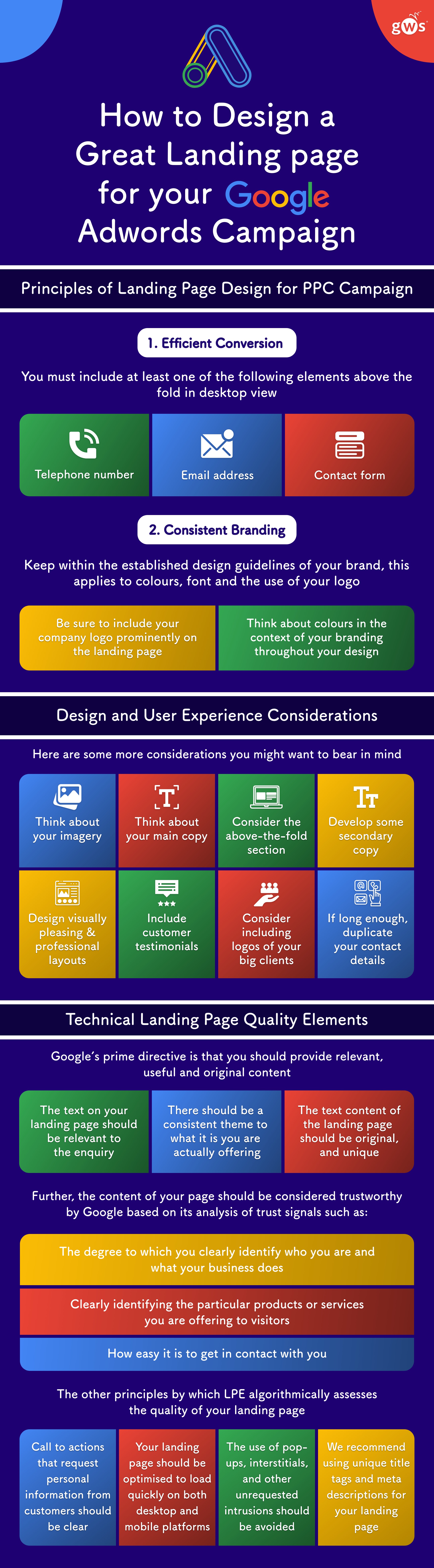
Principles of Landing Page Design for PPC Campaigns
1. Efficient Conversion
The first principle to keep in mind is that the main aim of a pay-per-click landing page is to convert the visitor and capture their details – whether that means they submit a form, or buy something from your website.
You must include at least one of the following elements above the fold in desktop view – and the more flexible contact options you include, the greater your chances of converting the visitor. Bear in mind that some customers may prefer to make telephone contact while others will prefer electronic messaging in one form or another.
- Telephone number
- Email address
- Contact form
The contact form, if included (which we strongly recommend), should feature a clearly recognisable Submit button and preferably have separate input fields for the name, email address and telephone number of the enquirer, as well as space for a message.
What you don’t want is to drive traffic away to other places, even other pages in your website, because that is a probable path to losing those conversions.
- Don’t include third-party links or advertising (e.g. Google Adsense) on your landing page. You shouldn’t have any links that will distract potential customers from what you’re offering, as that would be a total waste of the money you’ll be billed for the click to your page.
2. Consistent Branding
A second principle to adhere to is to keep within the established design guidelines of your brand. This applies to colours, font and the use of your logo.
- Be sure to include your company logo prominently on the landing page if you have one. Your unique logo should confer professional status and a sense of trustworthiness and gravitas to your landing page.
- Think about colours in the context of your branding. There should ideally be a set of recurring theme colours used throughout your design. These may be drawn from your logo if it has enough and suitable colours, or they may be taken from other pages in your website. A consistent colour theme will make your page easier on the eye.
Within these parameters, feel free to experiment.

Design and User Experience Considerations
Here are some more considerations you might want to bear in mind:
- Think about including a main image. While it is possible to create a landing page without one, pictures can be very effective tools of communication, so in most cases we would recommend it.
Think about what kind of pictorial imagery would best represent your services to the enquirer.
A balance struck between professionalism and friendly approachability may work best if you are selling to consumers. You’ll want to appear thoroughly competent but not unaffordably expensive.
If you are selling to other businesses, the question of what kind of image works best could depend on the nature of the trade. You’ll want the look to be professional and recognisably in keeping with the norms and customs for your industry, whether those are more formal or less so, but also on some level outstanding and impressive beyond the impression your competitors’ imagery achieves.
Where you do include a main image, it should be above the fold, whether standing on its own or as the background to text.
- Think about your main copy. You will probably need a catchy heading and some pithy but effective sales text to represent your products or services. Both should be above the fold.
The primary purpose of your main copy should be a call to action. It is recommended to include encouraging imperative verb forms such as ‘buy’, ‘get’ or ‘order’, and words that convey a sense of immediacy or urgency, such as ‘now’ and ‘today’.
- Consider the layout of the above-the-fold section of the page. Your main copy might in some cases work over the top of the main image (but in that case, make sure the contrast is adequate, choosing white text for dark backgrounds). In others, it could sit underneath or alongside.
- If you feel it would help with trust-building and conversions, develop some secondary copy to display lower down the page than your main call to action, taking care not to visually clutter the important above-the-fold part of the page.
Your secondary copy may consist of a series of subheadings, each followed by a brief descriptive paragraph, or could be a simple bulleted or even numbered list.
Whichever format you choose, the text can be tailored to a variety of purposes, including bringing out your unique selling points, relating your company history in brief, relaying your company values, and / or detailing some particular special offers on products or services you are currently promoting.
- Design and develop a visually pleasing layout to accommodate the secondary copy (where used). This can start just above then continue below the fold, or it may all be below the fold. In either case, those who choose to scroll down should feel rewarded by the appearance of the additional content, and how it looks will often be about as important as how it reads to keeping the viewer feeling positively minded towards your business.
It may pay to intersperse the secondary copy with additional pictures. Try to come up with an aesthetically appealing arrangement of copy and pictures.
- Include at least one genuine customer testimonial to give the undecided viewer a sample of social proof. Give the name (no need for exact address) of the one giving the testimonial, so the viewer has confidence in its authenticity.
- Consider including the logos of famous and well-respected brands for which you are an authorised stockist or service provider. This further supports your professional image.
- If your page is long enough to require considerable scrolling, duplicate your contact details and contact form towards the foot of the page, so anyone who has come this far doesn’t reach a dead end.

Technical Landing Page Quality Elements
Google now rates landing pages for quality using a yardstick it calls Landing Page Experience. It will give preference to Adwords listings that direct the user to landing pages that score highly on this measure.
Google’s prime directive is that you should provide relevant, useful and original content. This entails:
- The text on your landing page should be both relevant to the enquiry and useful to the enquirer. This means it should be closely related to the copy on your Adwords advertisement, with plenty of matching words. In other words, your landing page should be relevant both to your campaign ad and to what you’re trying to sell and advertise.
For example, if a keen amateur tennis player clicks on an ad for a particular branded tennis racket, they shouldn’t wind up on a general ‘all items of tennis and badminton equipment’ sales page.
- There should be a consistent theme to what it is you are actually offering, brought out in your Adwords listing and your landing page. Google may penalise Adwords listings that lead to landing pages which appear to offer something different from what was implied by the Adwords listing itself.
- The text content of the landing page should be original, and unique to the page, not registering as duplicate content lifted from one of your permanent website pages or as plagiarised content from elsewhere on the web.
Further, the content of your page should be considered trustworthy by Google based on its analysis of trust signals such as:
- The degree to which you clearly identify who you are and what your business does;
- How clearly you identify the particular products or services you are offering before you ask the visitor to make contact;
- How easy it is to get in contact with you - you can also boost trust signals by providing a contact telephone number on the page and by including links to your business’s social media pages.
Among the other principles by which LPE algorithmically assesses the quality of your landing page are:
- The purpose of any call to action that requests identifying personal information from customers should be clear, and the use that you will make of this information should be transparently declared, in line with the principles of European Union data protection legislation.
- The landing page should be optimised to load quickly on both desktop and mobile platforms. Image optimisation is essential, but scripts and slow shared server access issues are also often implicated in slow page-loading times, so page loading speed is partly the province of skilled developers, and partly that of hosting choices.
Google now offers a dedicated page speed measuring and diagnostic resource for sites running on mobile devices at https://testmysite.withgoogle.com/intl/en-gb, in addition to its established Google Page Speed resource covering desktop and mobile.
Experienced developers can make web pages load faster on mobile devices by using the Accelerated Mobile Page (AMP) programming protocol, which is gradually gaining in popularity.
- The use of pop-ups, interstitials, and other unrequested intrusions upon user experience or obstacles to navigation should be avoided.
- It is recommended to use unique title tags and meta descriptions for your landing page, just as you would for any normal page in your website. These should reflect the themes brought out in the page content and its purpose.
View our PPC / Adwords Campaign Management Services