We’re looking at all the ways in which you can make your website sing for both your customers and any potential customers. Win them over with the website of your business or brand with these few simple steps:
An updated, modern design

With such a competitive online marketplace as is found nowadays, the need for an updated, modern website has never been more important. Users expect a site that is simple to navigate, one in which they can find what they are looking for with ease, and that has a fresh, clean feel as they make their way through it. Presented with anything less than this, users may lose interest quickly and move on to the next thing.
Mobile-friendly experience
With a substantial number of users now using their mobile devices for a large amount of their browsing time, making your site mobile-friendly is a no-brainer. Design with mobile in mind, make it responsive and ensure that the experience you offer on a mobile device matches that of the experience you offer on a desktop.
Offering this consistent cross-device experience will show real commitment to the customer in that you want to make their journey as easy and enjoyable as possible.
Be easily contactable - list all important business information
Make it super-easy for customers to get in touch and for them to be able to get in touch in a number of ways. Have a contact form, a visible email address and a phone number; and list your business hours, when they can expect a reply, and any other information that you think is important to note. This will mean that the customer has a number of informed options on how to get in touch. They may well prefer one option to another for personal reasons, or one option may be more suitable than another depending on where they are in the customer journey. For example, if they just want to request further, general information on a service you offer then perhaps email would suffice, but if they are trying to complete a purchase and have come across an error on your site meaning they cannot move forward, then a telephone call for immediate help would be more suited.
Offering up all contact details and important information on your business from the off also helps to set an expectation for the user for things like when they can expect a reply from you and times that you are likely to be unavailable.
Connect social media
Connect your social channels to your site to help build a full rounded experience of your business presence for the user. Imagine yourself as a new, potential customer who wants to find out more about a brand. With just a click through from the site, you can follow the business on their social platforms, keep up to date with their regular news updates and really get a feel for the brand.
Use social media to your advantage by making your business able to build a relationship with those potential customers through your social channels.
Powerful & engaging visuals

Include powerful visuals throughout your site, in order to make an impact and be memorable for the user. Think about what makes your brand or business different: what do you offer that your competitors don’t, and how can you make this visible through an image? Highlighting these differences with engaging visuals will have users tempted by your offering and perhaps help them on their way to a purchase.
Consistent branding
Through the use of strong branding across your site, you can tell the story of your business and set the tone for the potential customer’s journey going forward. Ensuring this is consistent as the user moves through the site will make for a more unified experience that gives increased confidence in the consistent quality of products or services to be expected from your brand.
An easy-to-navigate menu
We’ve touched on navigation and the importance of it in an earlier point, but it does deserve its own mention. The danger of the navigation of a site is that it can very quickly become too complicated and confusing if you try and include lots of granular details or links to the same destinations in multiple places within the same page. As much as there is a temptation to include lots of links, for example a combination of multiple drop-down menus at the head of the page, an additional menu in a sidebar, and further links within the body text of each page, really think about what you’d like a potential customer to do when they reach your site and how they might use it. Will duplicate links to the same destinations help them or just confuse them?
While a main drop-down menu is generally a quick and easy method by which users can navigate your site, make sure yours is easy to access and doesn’t have so many tiered elements that it spoils the experience for mobile users who can only access it via a hamburger. You should also try to ensure that the most important pages in your site are available only a click away from the home page, and all pages no more than two or three clicks away. To make the best use of your nav bar, top-level links from your navigation bar should go to the local home pages of major sections of your website and not be wasted on single end-pages of minor impact.
Sensible & clear calls to action
![]()
Following on from the point above, now you have a clear idea of what journey you’d like your customer to take when using your site, you can use this to inform both the navigation design and your calls-to-action. These will act as direct instructions for your user on the next step you would ideally like them to take if they have read that far and thus demonstrated an interest in a particular area of your product or service offering. Whether the instruction is of the nature of ‘Contact us’, ‘Read more’, or ‘Buy now’, use these CTAs to encourage your users in their next step.
Security, security, security!
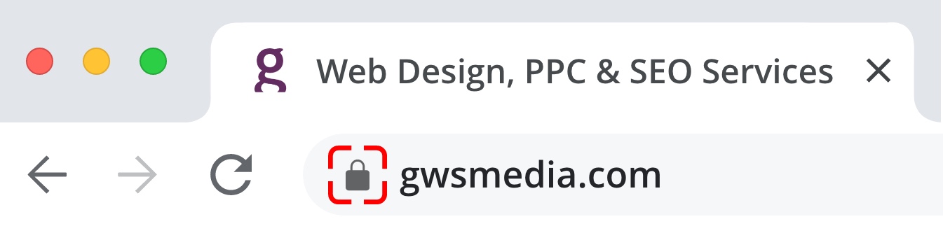
Nowadays, offering anything less than a secure site experience just won’t cut it. Having a secure connection in the form of an SSL Certificate (the padlock symbol next to a URL within a browser window will show that a site has one of these) means that any information you input in to that site will be sent privately and securely. Users are now clued up to this and may well be hesitant to use your site if they cannot see the padlock. Put your potential customers mind at ease ensuring that the security on your site is up to scratch!
Obtaining and installing an SSL Certificate for your website is a technical process that normally requires the assistance of your web agency. They may also need to be renewed every couple of years to remain valid. But the time cost invested in this is money well spent as compared with the alternative of having your website flagged as ‘insecure’ to potential customers. Imagine if you went to a bricks and mortar store and saw that the police or government had drilled on a sign above the door reading ‘Unsafe trader’. That is much how the ‘insecure’ notices impact the end-user.
Make checkout easy if selling online

With the likes of Apple Pay and Google Pay and other checkout options nowadays available that make the purchasing journey in sites using them incredibly easy for the end user, ensure that your site can keep up with the competition by installing your own quick-to-use automated checkout plug-in.
A complicated checkout system, with many steps and lots of information to input, may put some customers off and mean they give up and abandon their basket. Really think about the process that you use and the information you need to collect. Streamline this as much as possible to maximise the appeal to customers and minimise the obstacles in the way of final purchase.
Show off your customer testimonials

Show off your customer testimonials. If this is done in a humble and informative way rather than an aggressive, brash way, it will have the power to influence user behaviour. Potential customers will be interested to hear how others have found services or products, so anything that will really make your business shine here would be great to include. Ensure these testimonials are authentic and relatable, and that they show that your business stays true to its values.
Avoid intrusive and complex cookie options pop-ups

There is nothing worse than landing on a web page, ready to browse, only to then be faced with a particularly complex cookie pop-up. We understand that such pop-ups are perceived as being important to their legal coverage by many businesses today, but they can be very off-putting when they are very text-heavy and filled with numerous options that require the users time to meticulously go through to find out exactly what they are agreeing to. If you insist on having one, then for ease of use and to avoid a great many people unnecessarily leaving your site, make it as simplified as it can possibly be; and for best customer experience, always include a simple one-click option to reject all non-essential cookies, as that is the customer’s right under GDPR, and making it complicated to set up could reflect negatively. It is also worth thinking about the design: the uglier they are, the less likely a user is to have a positive initial experience of your website, and they may immediately click away from your site rather than waste precious personal time on setting cookie options.
If after reading this article, you think there may be areas of your own website you could improve in order to boost user appeal but are unsure of where to start, get in touch. At GWS, our Web Design Services cover a range of areas including general design to more specialised services, with a focus on Ecommerce websites and Member sites. The team would be happy to discuss your needs.