Twelve Signs you Should Upgrade or Replace Your Website
1. The design is not adaptively responsive to a full range of modern screen resolutions.
Responsive web design became an essential requirement of web design in 2011-12 as smartphone visitors became more and more significant for websites.
Even back in 2005/6, it was possible to define a mobile stylesheet to show a version of a website on Blackberries and iPAQ devices. But generally, sites either didn’t support mobile screens, or had separate mobile versions at a different URL.
The first iPhone was launched on the marketplace in June 2007 and had a screen resolution of 320 pixels’ width by 480 height, in contrast with the standard fixed screen resolution of the day, which was typically 1024 pixels across by 768 pixels down, with some older screens still having a resolution of 800 pixels across by 600 pixels down.
The lower screen resolution of early smartphones created a need for what has since become known as responsive web design, allowing optimal display on both older and newer resolutions of monitors and on the new smartphones. However, it took several years for such practices to be widely applied within the web development world.
The most recent smartphones tend to feature much higher screen resolutions.
Websites that don’t adapt to different screen sizes are now very uncommon. However, there are still many older websites that exhibit limited responsiveness.
While content that goes off the edge of the screen on a phone, creating the dreaded horizontal scrollbar, is traditionally the bane of the web design world, in many cases problems are also to be found at the other end of the scale, with websites that do not adapt properly to the highest screen resolutions.
Websites that were designed some years ago to cope with ranges of resolutions up to 1280 across can show visual glitches on the 1920*1080 (full HD) screens that have been common since the early 2010s, ranging from gaps to repeating backgrounds, and look even worse at 2560*1440 or higher.
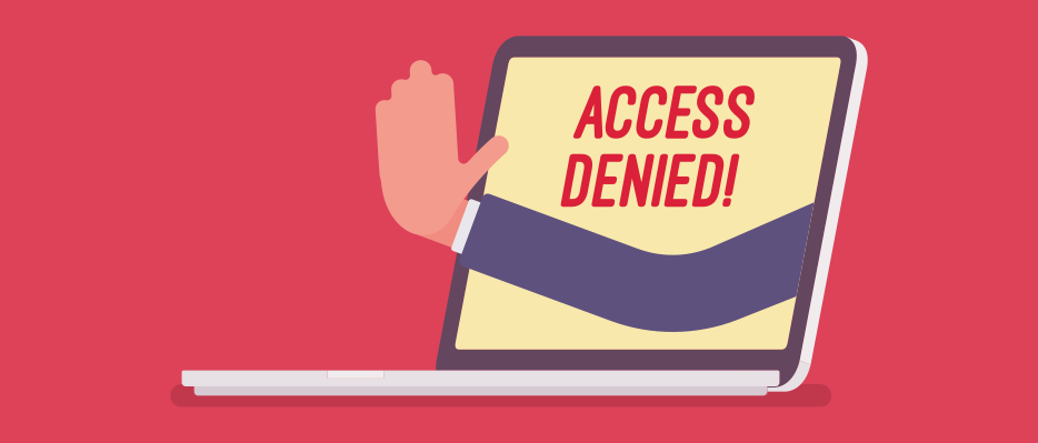
2. The content management system is non-standard or no longer supported.
Most content management systems require updating from time to time with security patches and bug fixes. These are normally provided by the CMS developer.
However, when a CMS is no longer supported, whether because it has reached ‘end-of-life’ after being replaced by a newer version or because it is a custom CMS that is no longer being developed or updated, continuing to run a website with an old CMS can present untold security hazards for the website owner.
Hackers may find and exploit security flaws in the CMS, and if that happens when the CMS is no longer supported, you are potentially completely unprotected against this. Your website may be at risk of destructive hacking (with content modified or defaced) or the interception of sensitive data and passwords which could be exfiltrated to criminal gangs.
3. The content management system is difficult or slow to use.
No matter how good a website looks or how well it works, if the content management system that is used to update it is difficult, unintuitive or otherwise slow to use, you may find that you and / or the team that supports it waste a lot of time on updates that should be straightforward, which is ultimately a waste of money and could even act as a disincentive to making updates that are really necessary or would significantly improve the appearance or functionality of the site in the future.
If your CMS is causing you trouble, you might want to consider ditching it in favour of one that is easier to use, and that normally means rebuilding your website, even if you base the new version closely upon the look and feel of the old one.
4. The content management system is limited in flexibility.
Another common scenario is a CMS that may be straightforward to use but is too restrictive in terms of what you can achieve using it.
If you need more sophisticated functionality than your current CMS can provide, it may be advisable to rebuild your website in a more flexible CMS, rather than trying to bolt on to the website functions that the CMS is really not designed to cope with.
5. Storage allowances are too restrictive.

If your website is provided as part of a hired package with a certain amount of hosted storage space and you need more space than that for all the needs you have in mind, whether images, video or very large quantities of data, then you might need to think about moving to another provider that offers you more space.
Hard drive space on servers is much less expensive than it used to be, so it is now rare to encounter restrictive storage limits that do not meet your business needs unless you have a very old hosting package.
6. The navigation system is hard to find or to use.

One of the most basic requirements of any website is that it should be easy and intuitive for the user to get to any piece of content in it from the home page. It should not be necessary to use a search bar or to scroll to a URL sitemap linked in small text from the footer to find the page you are actually looking for.
Having a navigational bar in the header or side of the page (or the equivalent for lo-res. mobile devices, a clickable ‘hamburger’ that opens out into a menu) that is easy to find, clearly displayed and easy to use is essential for usability. It is better for user experience on desktop and laptop devices if sub-pages from top-level items in the main menu display without it being necessary to click on the top-level items – merely hovering with the mouse or trackpad should suffice for the menu to open out fully. That way, all the second-level and even any third-level menu items are just one click away from the home page.
It is a well-established observation that website users experience ‘click resistance’, which is to say that any extension to their browsing experience that requires additional clicks reduces the chance of the destinations of those clicks being arrived at. So if you have a page that takes three or four clicks to reach (as opposed to one or two), the number of people viewing it from the starting point of navigating within the site is likely to be radically reduced.
Much the same principle applies to blog posts and articles accessed from ‘blog’ or ‘news’ pages. When these are arranged in chronological order over numerous pages that need to be sequentially accessed, it’s very unlikely that any of those beyond the first page will be viewed by most visitors to the website, and even more unlikely that any beyond the second will be viewed, and so on. As a result, once you have more past blog posts or articles than will fit on your default blog or news page, it is therefore a good idea to create a permanent menu page within the site that displays all past articles you feel are worth keeping readily accessible. These can be sorted in different ways according to your preference for user experience, whether by popularity, by theme, or simply in alphabetical order.
7. Text is too small or hard to read.
As screen resolutions have risen, so the amount of space occupied by text of a particular nominal point size has reduced, resulting in the need for standard web font sizes to increase over time so that text remains large enough for those with short sight or minor visual impairment to read clearly.
In the old days of CRT-based VGA monitors running at 800 by 600 pixels, size 10 fonts were a decent size for text; and even at 1024 by 768 they were acceptably clear.
Many newer fonts are inherently smaller for a given point size than the old standards like Times New Roman, Arial and Verdana, which were used on most websites in the past.
As a result, while you can still get by with Verdana or Arial at size 12 for displaying text in an article (though 10 is nowadays inadvisable except for footnotes), if you are using any of the more elaborate 21st century fonts, you are likely to find that size 12 and even size 14 are too small, and that size 16 or in some cases 18 is a much better fit. In any case, you should consider how your text looks on a high-resolution display running at at least 1920*1080, and ideally not just on a large desktop screen at that resolution but also on one of the more recent generations of smartphones, to assess how easy it is to read.
Another common user experience failing of websites is that they have been designed by designers with an emphasis on visual imagery and a certain ‘look’, to the detriment of the readability of text. Most commonly, this will take the form of text that is printed in grey or on a grey background, leading to low contrast, which makes it much more difficult for the brain to register and comprehend characters and take in the meanings of words. Older people and those using glasses may be particularly badly affected by low-contrast text.
When it comes to readability, some fonts are by their inherent design properties also easier to read than others. The well-established rule is that cursive fonts (e.g. Times New Roman) should not be used to display text online, because they are more difficult to read when converted into pixels on screens than non-cursive fonts (e.g. Arial, Verdana) – even though they may look fine as physical newsprint. Nonetheless, a great many web designers break this rule, and generally to the detriment of user experience.
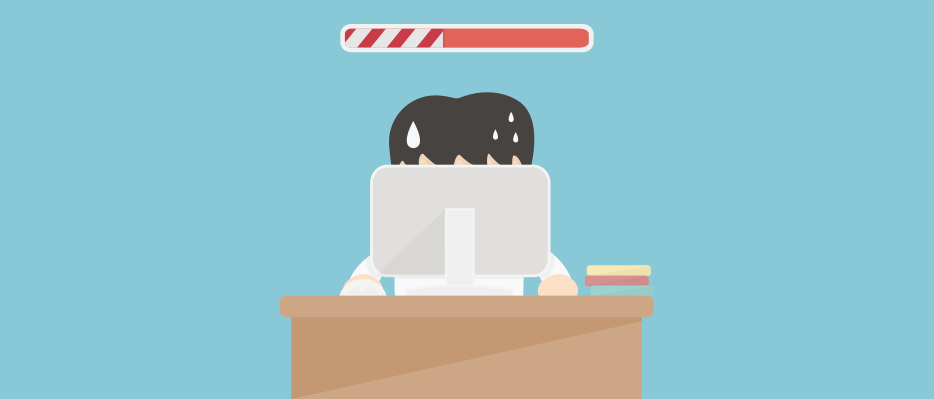
8. Pages take a long time to load and save.
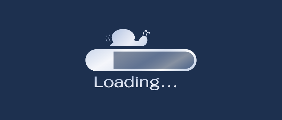
The longer it takes for a page on a website to display properly, the greater the likelihood that the user will get bored and impatient and leave the site. This can be a hosting issue, but the design and construction of the website also makes a significant difference to page loading time, and a skilled developer can help you to optimise pages for speed.
If you are editing your own website, sometimes you may also find that it takes a long time for pages to save, making it tedious and inefficient for you to update your website. Again, this is usually caused by the hosting, but there may be other causes such as a large database or a CMS which does not cope well with certain types of data.
9. The design is visually unattractive, cluttered or stylistically outmoded.
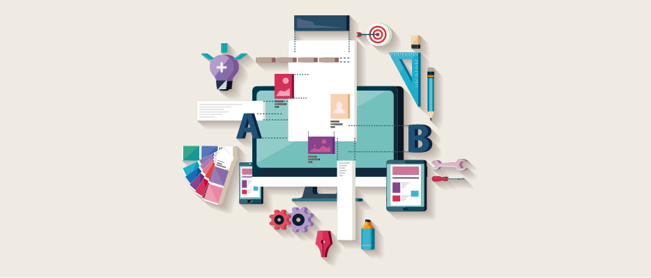
Even if font size and contrast is not such an issue on your website, you might find that you just don’t like the design any more or that it has fallen behind the times compared with the competition in your sector.
Sometimes also websites that serve many purposes or host busy shops can have too much visual clutter on their pages for users to find them pleasant and easy to use.
If you have links that are too close together or differently styled and coloured elements clashing with each other (trying to grab people’s attention), the effect may be the visual equivalent of a cacophony of sound, and actually put people off.
A clear, uncluttered and visually harmonious redesign may be called for in any of these circumstances.
10. Bounce rates or exit rates from the home page and key service and product pages are high.
No matter what you think of your website’s design and navigation, if you find that there are high bounce rates or exit rates from key sales-oriented pages such as your home page, product or service pages, then there could be something in the design that is letting you down and deterring people from venturing further.
A skilled designer or user experience analyst may be needed to assess how bounce rates or exit rates can be reduced in the cases of the pages that matter most.
It is common for bounce rates and exit rates from blog and news articles to be much higher, since their primary purpose is to inform, and many users will access them through search engines because they are seeking answers to an individual question, so different logic applies here, but such pages should still be designed in such a way as to maximise the proportion of traffic that lands on the page continuing to further pages or getting in touch.
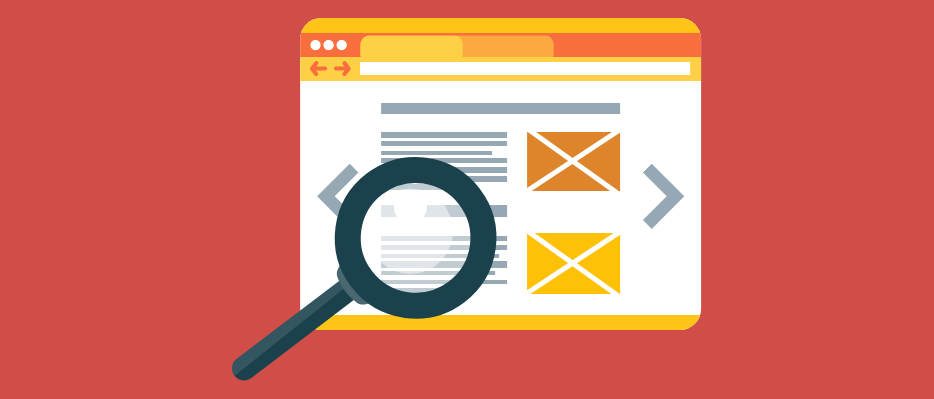
11. The website lacks the required visibility in search.

If your website is getting very few visits from online search, except for searches specifically for your brand or company name, that is sometimes a sign that it is not performing as well as it might be in terms of drawing in new potential customers who have not heard of your company before.
The field of search engine optimisation encompasses many different factors including headings, meta tags and user experience. Ultimately, if Google’s algorithms don’t believe that a page in your site offers as good a user experience as alternative websites for a particular search query, they will rank it down relative to that competition. And for as long as your website does not have high positions in your geographical area for your key products and services, then you are likely to be losing out on potential business.
A website designed with search visibility in mind at the outset is more likely to be a sound investment for the long term.
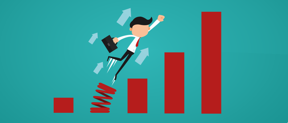
12. Conversion rates to enquiries or sales are low.
Often connected with point 10 above is an observation of low conversion rates of traffic to enquiries. No matter how effective your meta tags, headings and page content are at drawing in visits from search in the first place, if your visitors don’t take actions leading towards the purchase of your goods or services, then they are effectively only window-shopping, and there is no immediate tangible benefit to your business in that.
Depending on the nature of your business, you may want your website visitors to telephone you, send you an enquiry through your contact form, email you, or process a virtual shopping cart through your online store and complete an order there and then.
If you are getting low rates of conversion of traffic to your desired outcomes, it may indicate that the design of your website needs a rethink with a view to improving conversion rates.
All of the above are factors to consider when thinking about whether your website serves its purpose effectively and if it might be time to update it. This can, potentially, be a big job, depending on the needs of the site. It may be that a number of updates can be made to your existing design, or it might be that the whole site needs an overhaul. At GWS, we know the importance of an effective website for a business. We are on hand whether it’s smaller design features that need changing or a complete redesign. We don’t shy away from a challenge. Get in touch today to discuss.