Web Design Case Study: Mensa International
As our recent posts looking at green websites and charity websites from a design perspective have received a good response, we have decided to start a new series: interviews with our web design team to discuss the process of designing a particular site.
So to start we chose the Mensa International site.
 |
| Detail from British Mensa: its members stand out from the crowd. |
What was the starting point for the Mensa International website?
GWS was brought in to redesign Mensa International's website, so the design process started from looking at their previous site, and other national Mensa sites, which gave us different impressions of what Mensa stands for.
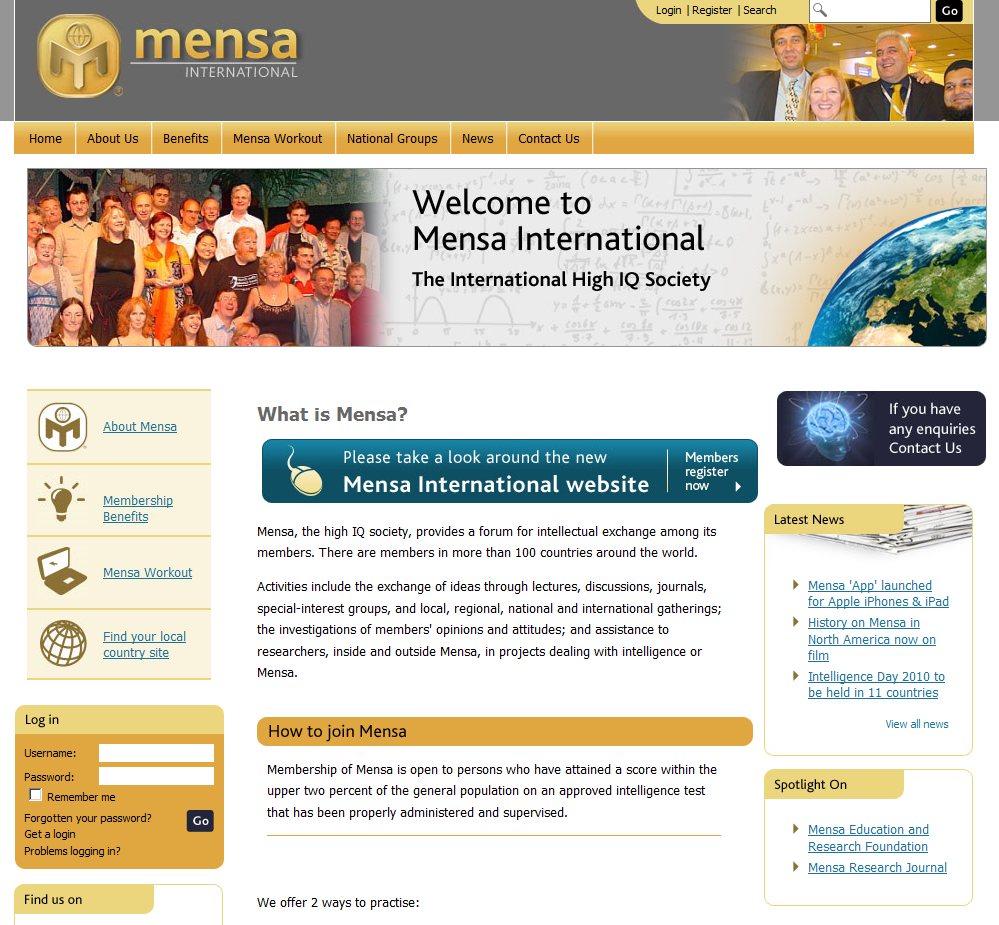
The British Mensa site contains a lot of information about the organisation, and emphasises the select nature of membership.
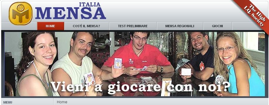
The Italian site highlights the importance of the group experience by using a photograph as a banner.
In contrast, the site for the Czech Republic seems a lot more corporate in its use of colour and layout.
Having identified some key themes and the way they are expressed by the other Mensa sites, we looked at other sites with international members, to think more specifically about how the international nature of a group can be communicated and how these relate to what was needed for the Mensa International site.
These included:
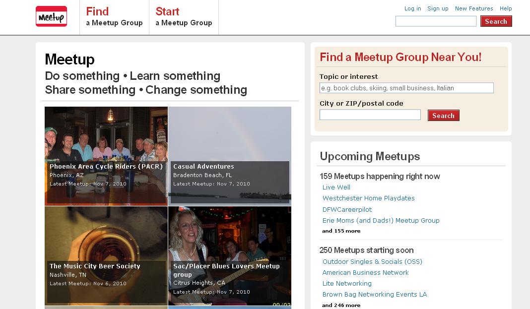
- Meet-up, which communicates its internationality and benefits of membership through its striking use of photographs.
- Babcock International, which uses an uncluttered layout to communicate its message with clarity.
- Expro, the design of which feels very clear, but perhaps too corporate and oversaturated with the colours chosen for the direction we wanted to go with Mensa.
Finally, because the IQ test is an important part of Mensa membership we looked at sites offering IQ tests to see how they were presented.
This research gave us a broader picture of how membership sites communicate their internationality and the benefits of being a member - two things which seemed very important when approaching the Mensa International website.
We were particularly struck by the use of photographs to communicate this, and the ways the most striking sites managed to achieve a clear message through uncluttered layouts and strong use of colour.
How did you go about evoking the core theme of the site through design?
Having identified the key themes of the site as internationality, group membership and IQ, and having used these core values to guide our initial research, we knew that we wanted to make them resound very strongly throughout the site.
These themes were focused into the design through the configuration of the banner that sits under the top navigation menu on each page of the site.
Each one is comprised of a group photo on the left, consisting of Mensa members engaged in an activity of meeting, with a corner of the globe on the right, and a background of handwritten formulae and equations in between.
 |
| Group membership / IQ / Internationality |
On the inner pages, the banners regularly change, using different pictures and facts about Mensa, which we thought was a striking way to communicate information clearly without cluttering the home page.
 |
| We particularly like the striking impact of the green in the group photo, and the way this draws the eye to it. |
More generally, the gold used on the site matches the logo, and the grey provided a good counterbalance.
Once a member logs in, the grey changes to a dark blue, thus efficiently and attractively communicating to members that they are logged in.
What did you most enjoy about the design process for this site?
The emphasis on Mensa as an international group, and using design to present membership as a communicative and inviting experience, was very satisfying.
We also enjoyed the clarity needed for the site to communicate a strong message; and being able to keep the design clear and striking through colours and photographs was a big part of that.
What was the most challenging feature to design?
Logos are always very influential on a site’s design, and we find ways to use elements of the logo to tie the design of a site together.
The standard logo usage guidelines challenged us to achieve a cohesive design in other ways, including the banner layouts that immediately and clearly communicate the key themes of the site.
For further details on Mensa International and how to become a member please visit https://www.mensa.org.