Today is the launch of Microsoft Windows 10.
Windows 10 is the latest in three decades of iterations of the world’s most popular operating system. With it comes a new logo brand and personality.
To celebrate, let’s take a look at the evolution of the Microsoft logo through the ages....
Microsoft vs. Apple: Operating System Logo Wars
Over the past few years, the fast, dynamic Apple has been creeping in.
Microsoft had started to lose traction with the young, cool, consumer tech crowd.
But Microsoft has managed to rejuvenate its perception, retaining its B2B following but also reinventing itself for a new audience of consumers.
One thing is for sure: branding, marketing and PR have played a key part in the war of the desktop.
The logo has been a strategic centrepiece in this rivalry.
Windows 1 & 2

1985
Developed by Bill Gates himself, the original Windows OS was a successor to the text based MS-DOS introduced by his company Microsoft in 1981.
You could say that Microsoft's new windows-based operating system was the synergy of graphics and computing.
Interestingly, the original Windows logo bears a striking resemblance to the latest Windows 8 / Windows 10 logos and colours.
It certainly seems as though design trends have gone full circle.
Windows 3
1990
Five years on from the launch of Windows saw the next major release and logo change.
Windows 3 was the first successful rival to Apple's Macintosh and the Commodore Amiga.
As graphics technology had improved, with Windows now supporting sixteen colours, the logo was redesigned.
With five colours now in use, the new Windows logo was a much brighter standard-bearer for its operating system.
Windows 95

1995
The high-profile launch of Windows 1995 another five years down the line marked a significant leap in technological advancement, with a further jump in design and GUI.
The first thing you may notice is the switch from Serif to Sans-serif font aesthetics in 1995.
This projects a softer, less serious attitude.
Whereas Windows had previously been a predominately business-oriented product, the new Windows 95 was Microsoft’s first major attempt at targeting the home computing market.
Windows 98

1998
The Windows 95 logo had stood the test of time, and was merely slightly revised and updated for Windows 98.
The GUI also didn’t change much, with most of the changes being found in back-end hardware and networking improvements.
Windows 2000

2000
With growing demand for operating systems tailored to particular functional needs, Microsoft had split the Windows offering into multiple products in the 1990s, launching Windows NT as a server version in 1993, and updating it in 1996.
But the Windows 95 / 98 branding had proven so popular that the NT brand was retired in February 2000 and replaced with Windows 2000. This called for new identities.
The typeface remained similar to previous versions, with a touch of colour and a tip of the hat to the famous start icon.
Windows ME

2000
Windows Millennium was aimed directly at the individual consumer, with its 'ME' acronym being played on to hint at personal use by being represented in some branding as 'Me'.
Its objective was to improve on Windows 98 and put more computers in homes.
The OS indeed saw significant advances in multimedia capabilities.
The centrepiece of the logo remained unchanged from that of Windows 98, but with more styling and colouring.
Windows ME proved to be a commercial stop-gap product, only being around for just over a year before it was replaced by the next major release.
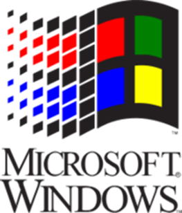
Windows XP
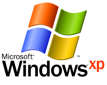
2001
The first significant change to note about Windows XP was to the naming convention for successive iterations of the consumer-oriented Windows operating system.
No longer being tied to specific dates gave it a longer market shelf life.
We saw a big leap in visuals with the Windows bliss background and a colourful user interface.
The typeface lost some weight, and the 'Windows' icons were updated to include depth.
Windows XP was widely regarded as a more secure and stable operating system than Windows 95 / 98, and although it also demanded significantly more processing power than its predecessors, hardware CPU speeds had increased rapidly since the late 1990s, and it proved to be a successful and long-lived release, with 1 billion copies sold worldwide.
Windows Vista

2006
With the Windows brand having become so strong that it was instantly recognisable by the mid-2000s, the decision was taken to remove the name of the company Microsoft from the logo for the next major release, Windows Vista.
A serious investment in custom typography went into the Windows Vista logo.
Microsoft designed its own font called Segoe, a font with clean and elegant yet innovative aesthetics, especially for its release.
The OS graphical user interface itself took on a more luxurious feel, with deep colours and subtle borders.
Despite the impressive visuals of its so-called 'Aero' interface, the Vista operating system was widely criticised for placing excessive demands on processor power and for crashing more often than Windows XP, resulting in many Windows users sticking with XP and declining to pay the cost of upgrading to Vista.
At the same time, Apple's contemporaneous Mac OS X was gaining in popularity, and some power users found themselves switching platforms from Windows to Mac as a result.
Windows 7
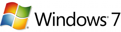
2009
Despite the commercial problems that attended Windows Vista, Microsoft wasn’t able to get its successor to market for nearly three years.
Dubbed an incremental upgrade, Windows 7 was intended to address the previous criticisms, especially issues around speed and stability.
The Aero interface was improved, providing great advances in how software was controlled with a GUI, but at the same time its graphics were simplified in the interest of faster performance.
The logo stayed much the same, but the shorter, numerical product name gave it a simpler, lighter feel than that of Vista.
Windows 7 was found to be fast and stable in use, drawing a warm welcome from users who had complained that Vista was too heavy, sluggish and unreliable.
This made Windows 7 a commercial success; and it is the most popular Microsoft OS in use today.
Windows 8

2012
The release of Windows 8 marked a more radical departure for Microsoft's main operating system.
The subtle hues and graphical shadings of Windows Vista, already attenuated in Windows 7, were now removed completely, replaced by simple blocks of colour, following a trend known as 'flat design' (meaning mono-colour design) that had become popular on smartphones.
Additionally, in the initial release of Windows 8, the Start button was removed, and the navigation system completely redesigned in a way that was optimised for touch-screen users.
It had the feel of a mobile operating system even when ported to a desktop or laptop device without a touch screen.
The reasons behind this dramatic change of tack would appear to have a lot to do with the exponential growth in popularity of smartphones at the time, as well as a fear of lagging behind Apple, whose minimalist aesthetics had paradoxically become associated with their position as a luxury consumer brand.
Whatever its reasons, Microsoft clearly felt the need to follow where it once led. Unfortunately, the OS couldn’t directly compete with the slickness of Mac OS:X or with the rise of the iPhone and iPad, failing to convert their loyal followers into Windows users.
At the same time, established Windows users who were happy with the ergonomics and aesthetics of the established Windows XP, Vista and 7 were alienated by Windows 8, and it divebombed in the marketplace, proving even more unpopular than Windows Vista had been at the time of its launch.
Windows 10

2015
Microsoft has responded to some of the criticisms levelled at Windows 8 by bringing back some of the lost navigational features of its predecessor, including the Start button.
At its launch, Windows 10 is hoped to be equivalent to Windows 7 following Windows Vista and addressing its shortcomings.
It has been initially well received by many critics of Windows 8.
However, the flat design values of Windows 8 have been retained, and indeed the logo goes even further in a bid to revitalise the MS image for the smartphone generation by incorporating more flat design and minimalism.
The Windows 10 logo sports a more streamlined version of Segoe, and a more mature-looking deep blue colour than that of Windows 8.
It also incidentally more closely resembles the first ever icon for Windows, as used in the logo for Windows 1 and 2, than any successive logo design had done.
Microsoft has stated that Windows 10 is a major upgrade that is going to be around until 2020.
With its 'one product family' concept, Microsoft is clearly trying to develop a sense of one operating system 'to rule them all'.
Launched as a free upgrade for all Windows 7 and 8 users to overcome resistance to paid upgrades, it is expected to gradually gain traction with Windows 7 users who have resisted Windows 8.
The Future
2020
Microsoft has hinted that the launch of Windows 10 may mark the end of completely new versions of Windows, with an ongoing service release upgrade policy allowing anyone with a Windows 10 licence to stay up to date with what should be an ever-evolving operating system far into the future.
If this proves true, we should see a lot more of the Windows 10 logo in the future, and possibly even beyond 2020, a year which will mark five years since the first release of Windows 10.
It is hard to predict the design trends of the future; but at the current velocity, could the Windows 10 logo be modified in the future without the operating system itself being replaced or renamed?
Only time will tell!
Let's look back at those logos again...
Following Windows over the years, we can see that progression and evolution for both the services they offer and their logo go hand in hand. An upgraded system is highlighted with an upgraded or refreshed logo. This is something you can do within your business too should it feel right. We offer a Branding and Corporate Identity Design service if this is something you want to discuss. Get in touch for more information.
NB: This article, originally written and published on July 29th, 2015, was copy-edited, revised and improved with additional relevant information on August 7th, 2019