Time for the next instalment of our series on University Website Design!
Previously we considered the particular challenges facing a university website, and how these are dealt with on the home page.
This week, we shall be looking at the inner pages, and the design strategies being used to handle the volume and complexity of information being communicated and the wide variety of visitors using the site.
As we've noted before, one major challenge of the university website is the sheer size and complexity of what is needed, reflecting the institution itself.
Because a university's website has to combine a number of different areas - a varied range of academic departments, research, history and outlook of the institution, and so on - the website can be seen as a large web of websites all connected via the home page.
As a result, the visitor might have to go quite far into the website to find what they need, so the design of the inner pages needs to support the depth of such a journey.
In this respect, the inner pages have not only to be attractive and functional, but also, and perhaps more crucially, to make sure the visitor doesn't get lost and that they can easily retrace their steps.
The worst case scenario would be to get further into the site but lose all sense that where you arrive is related to where you started out.
Ease of navigation is therefore of prime importance, particularly if you are setting out from a very striking home page.
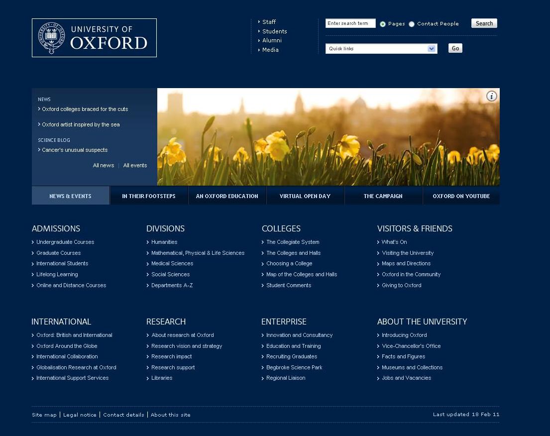
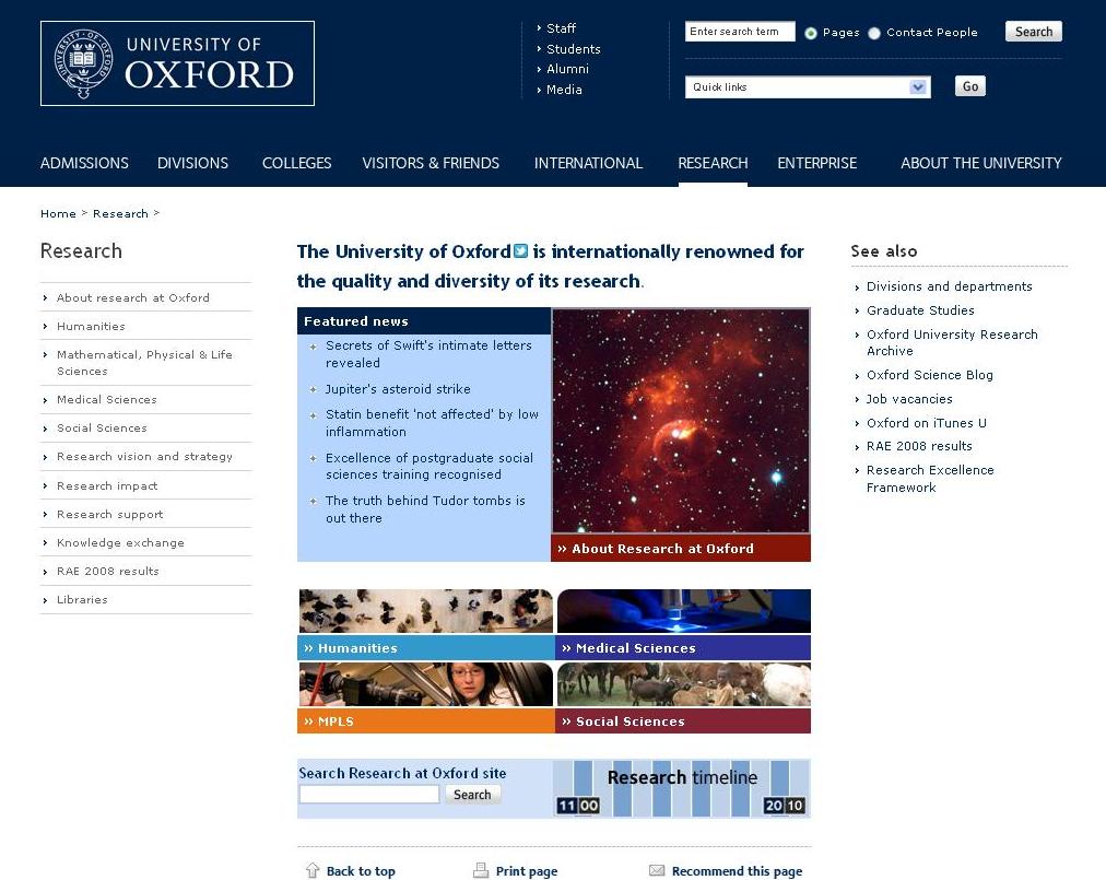
The inner pages of Oxford University's website look dramatically different from the front page, but a continuation of the Oxford Blue in the header and the strong placement of the main navigation on the top bar makes the potential confusion of moving between the two minimal.
There are two main design strategies being used to deal with this, helping to bring coherence to all pages on a university website, so visitors feel they are always in the same website, no matter how far they venture into it:
1. Colour:
As we noted in our post on Home Page Design, colour is often used to delineate different areas.
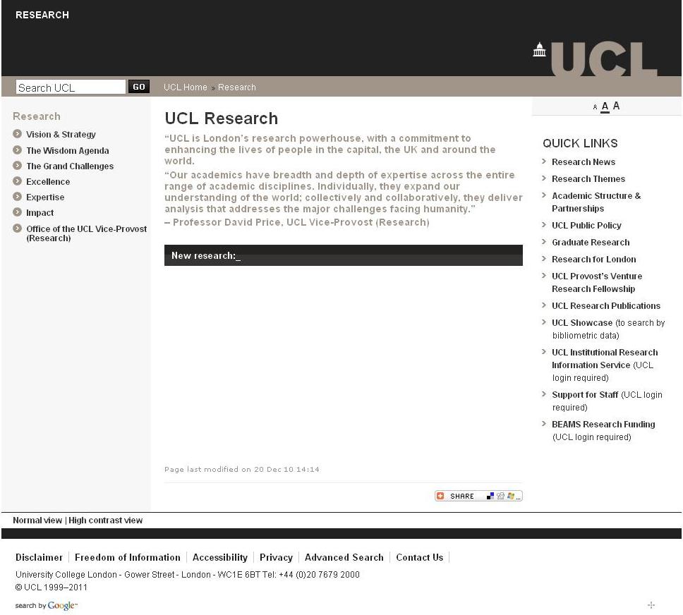
The UCL site did this very strikingly on its home page, so it's no surprise that the site uses different colours on the bottom of the top banner to signal different areas further inside.
Other universities also adopt this strategy, often using different colours to govern the design of different academic schools, whether they are incorporated into the main colour of the site (as with Glasgow and UCL) or whether the particular colour chosen takes over the different parts of the site (as with Bristol and Reading).
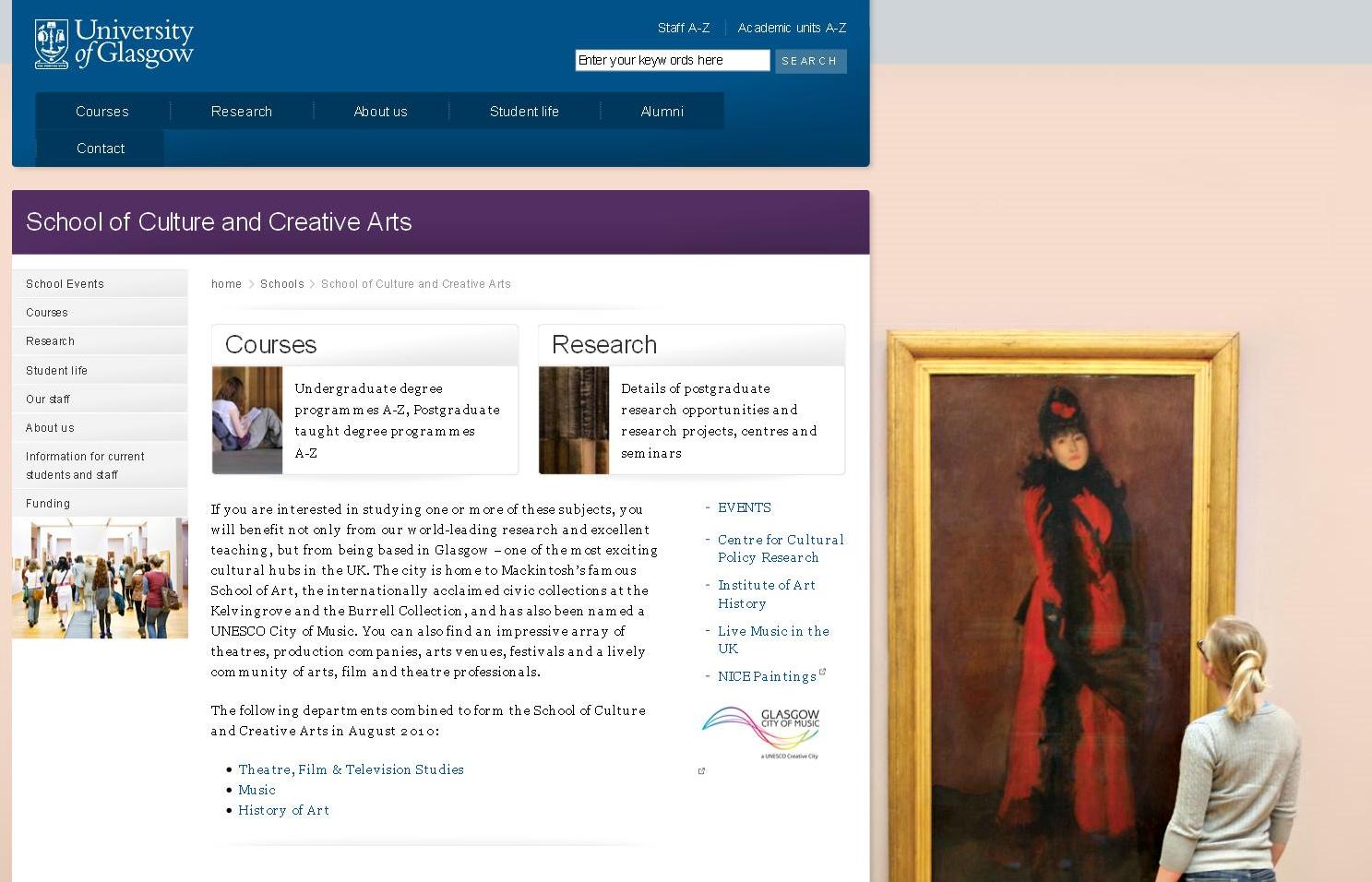 |
| Glasgow: the blue of the header remains while purple is introduced into the design of all pages in this section |
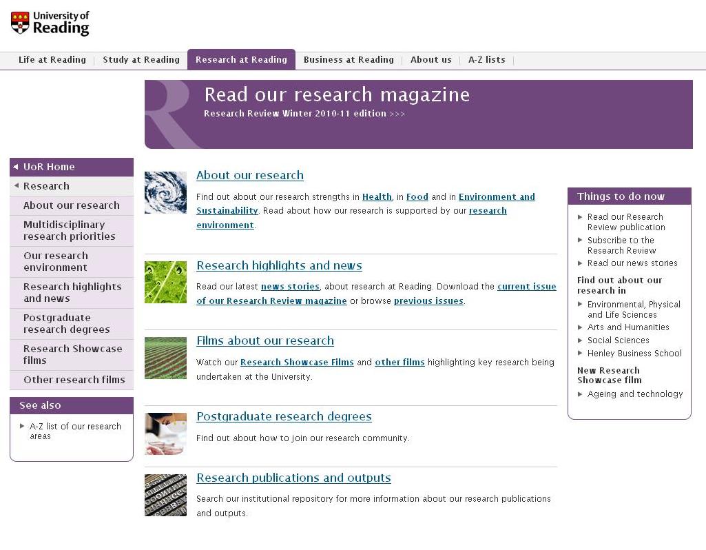 |
| Reading: a main colour is introduced into the layout of the page, and dominates each particular area / department |
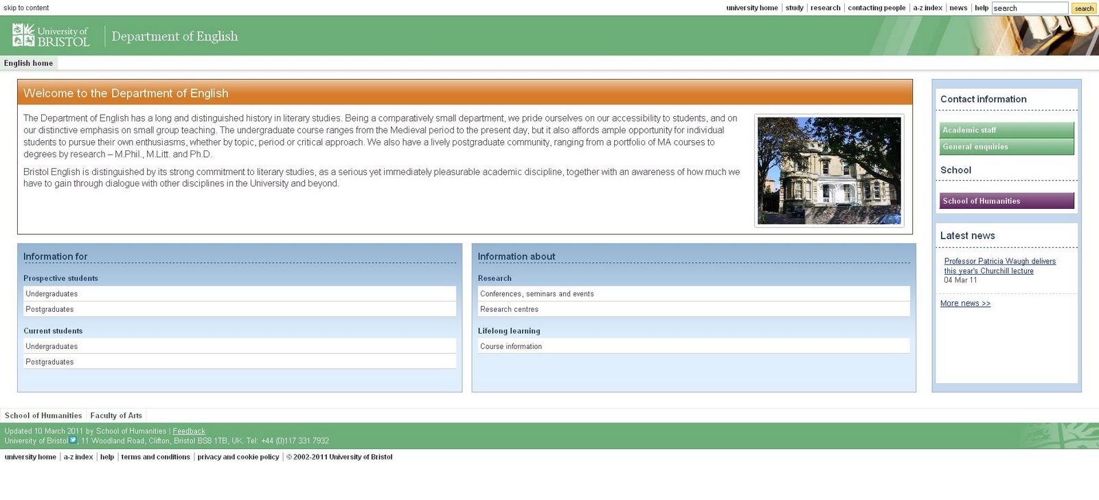
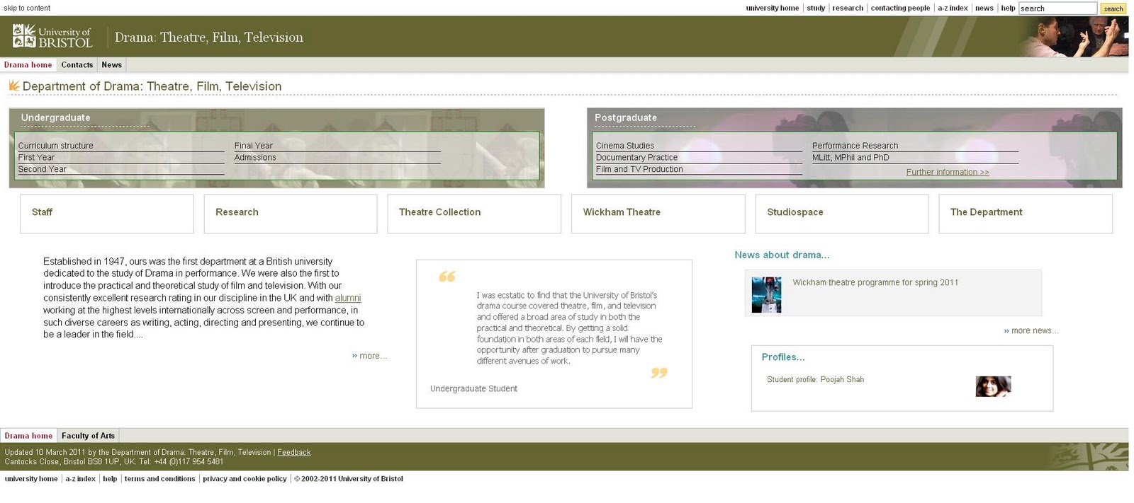
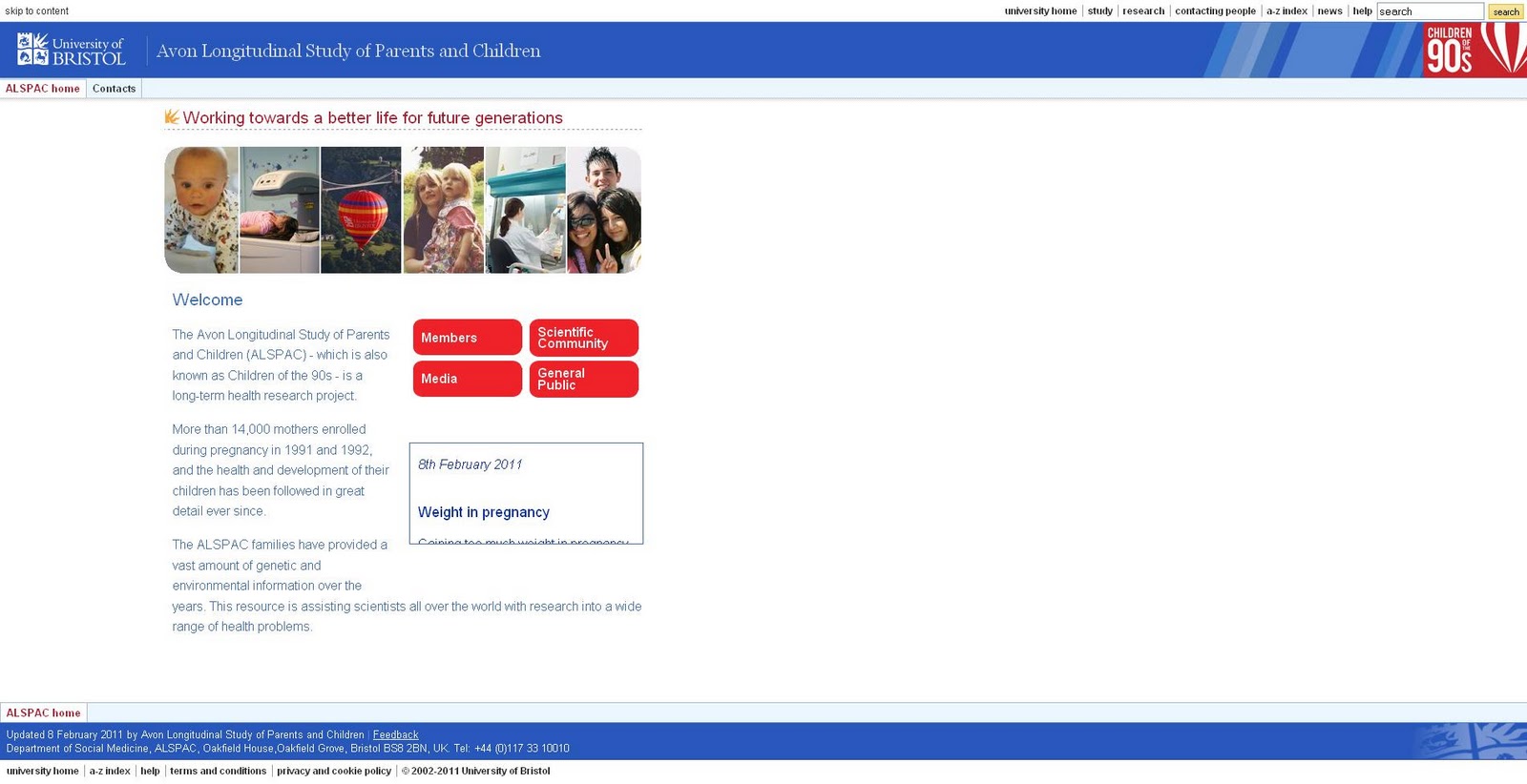
Bristol: as these 2 examples indicate, a very similar layout is used, with striking colour differences which permeate the look of each area.
2. Layout:
The other way design coherence is achieved is through the graphic repetition of layout.
The placement of different areas thus becomes like a graphic template that is applied to each page, so that there is a visible relationship between pages, and therefore the visitor comes to know where different elements of navigation are located.
This can be achieved quite simply, as seen in the minimalism of Northumbria's website, or with a greater degree of complexity, as in Bristol or Reading's sites which combine use of colour with this repetition of a particular layout template.
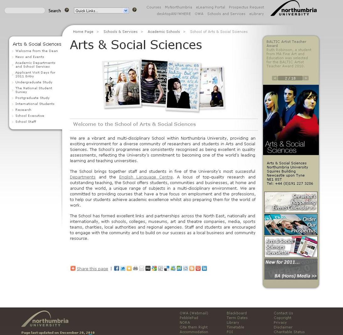 |
| Northumbria: This layout, with each area's navigation on the right and main areas at the top & bottom, is adopted in each of the main areas. While it is not as visually striking as the home page, the lack of visual clutter makes it easy to navigate. |
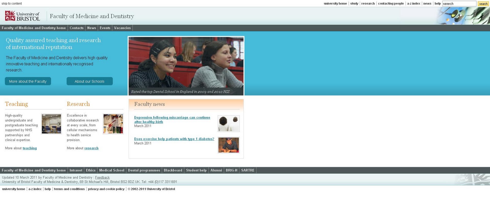 |
| Bristol: These 2 pages, from the ALSPAC research group and Faculty of Medicine, are very different in terms of content and colour, but coherence is achieved through the similarity of layout and repetition of design details (note the repetition of a unique design top left) |
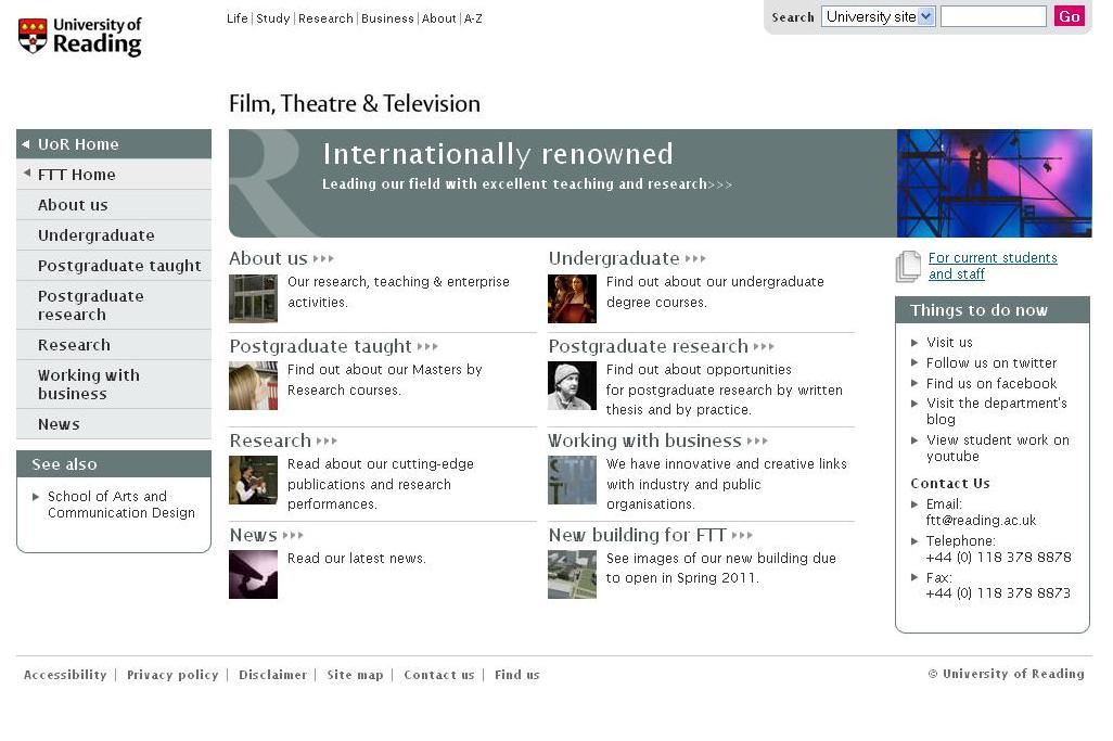 |
| Reading takes a very structured approach which repeats the use and placement of navigation boxes incorporating the distinct colours of a particular area. The repetitions of the 'Things to do now' and 'see also' boxes are particularly useful to the visitor, as well as eye-catching in their placement. |
Other Considerations:
Branding
The other important component of this is branding, and the way in which this is incorporated into the visual design.
Some universities, such as UCL, achieve consistency despite adopting quite different colours on separate pages or sectons of the site:
 |
 |
 |
| UCL: The UCL logo is incorporated into the visual changes of each area, without losing the impact of its branding |
Imagery
University websites often manage to enhance their visual attractiveness by using a wide variety of imagery, while still maintaining a coherent design.
Glasgow, for example, uses consistency in layout and the top navigation bar, and only a slight change in colour to indicate different areas, but changes the background image to communicate the diversity and excitement of the institution.
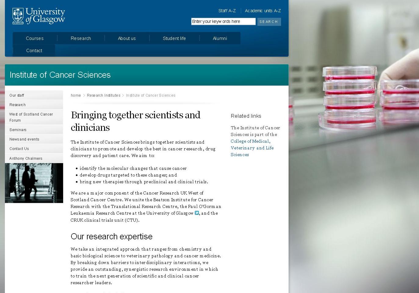 |
| Glasgow: as with the Arts Institute above, the main colour remains, with a minimal change of colour to indicate the different faculty, but the background image is changed for dramatic effect, without radically changing the look of the website overall. |
Looking at university sites is a useful way of thinking about design solutions to a particular set of challenges, with ideas that are transferable to different kinds of websites.
For our final post in this series, we will be taking a look at the way in which universities approach their wider web presence, and how the use of social media ties in with the design elements of their websites.