This week, we shall start our series on the design of social media sites with a look at Facebook.
We have several previous posts about using Facebook for business, and it is a regular subject of links in our weekly round-ups - in many ways, it has become the social networking site for businesses.
There are many reasons for this, not least its impressive size and influence (there are more than 800 million active users, at the time of writing, and more than 900 million pages, groups,events and community pages that people interact with, with the average user connected to 80 community pages, groups and events).
In this post, our focus will be on something we haven't talked about before: the design features and look of Facebook.
Facebook has undergone many changes in the design of profiles and the way information is shared between friends since its beginning.
For a comprehensive run through its different looks, with changes in profile design and introduction of the news feed, take a look at this Business Insider article.
Although there are major differences between the first design and now, certain elements of layout have stuck throughout, most notably the organization of the top menu bar (Facebook logo to the left and navigation to the right) and the left hand navigation box, which takes you to friends, applications etc..
Perhaps that is why the introduction of the Timeline profile design feels like such a radical change; while the top menu bar stays the same, the splitting of layout of the main profile page constitutes a major redesign of the way the profile is and has been set out.
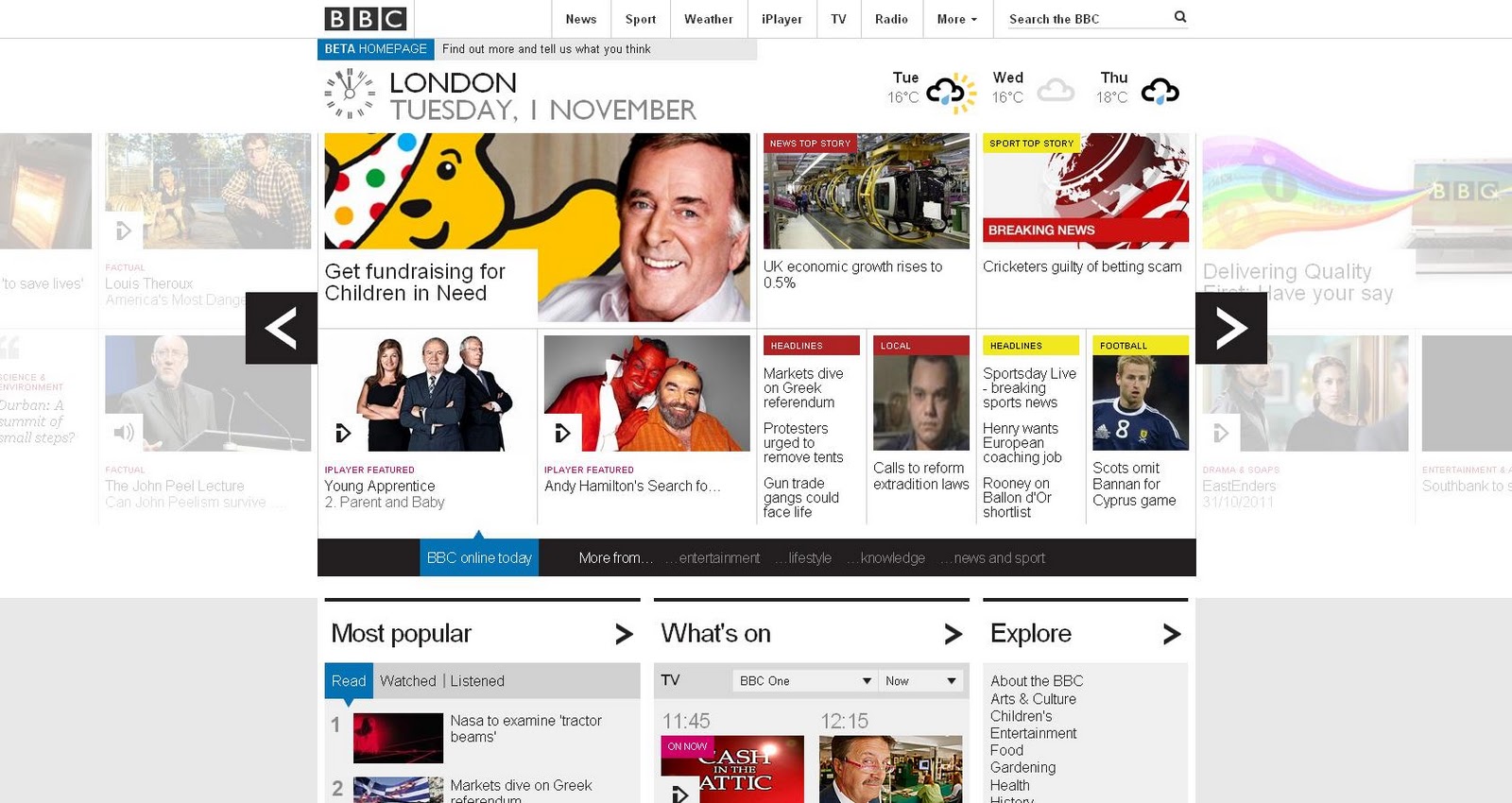
At the same time, the introduction of a more visual layout makes sense in the context of the way website design has changed since Facebook began - it might seem overly complicated in comparison to what we've become used to, but not in relation to websites like the BBC's new site, which breaks information into chunks, with foreground information relayed primarily by images.
So what can we take from the various elements of Facebook's design?
The key aims and strengths of the site are user interaction and engagement, which are important to business websites, particularly for ecommerce sites, so how does the design work to accentuate that behaviour?
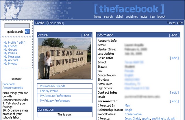 |
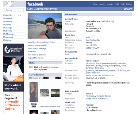
| an original profile |
1. Branding.
The most significant constant for Facebook is its branding, and particularly the use of font and colour.
Blue and white have always been used in the design, which offers a fairly minimalist and spare look to the site, so that design features and interest come from the user's own customisations of their profile and additions of content.
As a result, throughout changes in other areas of design, it has always looked like Facebook.
This continuity of design is very important and demonstrates that consistency is important to user experience.
If a site changes too radically, whether through re-design or in moving from one section of a website to another (perhaps a home page to an ecommerce area), this is extremely off-putting to users.
Maintaining a visual consistency, signalled through colour and logo, so that even if a layout has changed, your site looks like it is still your site, is key.
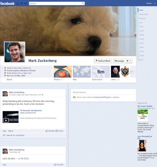 |
| The new Timeline profile |
2. Navigation.
As we've discussed before, clear navigation is the key to any effective website.
For Facebook, navigation is very important - users need to be able to get to what they want in order to communicate with friends and see news.
The central challenge for Facebook is that as the site has grown and changed, so has the volume and type of content available to users.
For this reason, navigation is split up into different streams - profile information, photos, news, friends and so on - and it seems that this compartmentalisation will continue as Facebook progresses, as indicated by recent changes which have split news into 'top stories', 'recent stories' and 'from earlier today'.
While this seemed to have initially caused some confusion and can make Facebook feel rather cluttered, despite its generally clean look, it does make sense to provide a more minute-by-minute access to news from friends.
Furthermore, the navigation of the site is consistently placed in blocks within the site, with sets of links to different content in strips on the left, centre and right. the Timeline Profile takes this even further and clearly marks out different elements of content by placing each post or activity in a separate box.
3. Interaction.
Most important to Facebook is the way it encourages interaction, and this should be of major interest to businesses wanting visitors to engage with the site.
First of all, all the things you can do on Facebook are presented using active language (like, comment, share, update your status, add photo, ask question), urging visitors to do rather than just observe.
Secondly, these calls to action are repeated constantly across the site.
Every post, photo, note etc features ways to interact - you can't escape Facebook's primary aim, to engage with its content.
Can you say the same about your business' website?
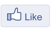
Thirdly, interaction is made incredibly easy - to register interest you like something with just one click.
The minimising of the number of steps between arrival and action is a central lesson.
Facebook's 'like' button may feel as if it's revolutionised the way we interact with the internet, but what is most striking is the simplicity of it.
The 'like' button achieves engagement in one action (unlike a blog which requires several steps for a user to comment), thereby radically increasing the conversion rate of the site (assuming interaction is the primary goal).
How could you reduce the steps from visitor entrance to goal achieved on your website?
What do you think?
These are just some of our thoughts on the design of Facebook.
According to polls on this blog and our Facebook page, Facebook is considered the best designed social media site - we'd love to hear more about why you think this is the case, so please let us know in the comments below, on Facebook or on Twitter.
Do you have a Facebook page for your business? Please share it with us!
As you can see, website design has to be specific for its purpose. We look further at this in part 3, Website Design: Twitter.