![]()
Last year we looked at the design of the main social media sites: Twitter, Facebook & Google Plus.
We considered the relationship between design decisions and website goals, and thought about how businesses could draw on design elements to encourage interaction and engagement.
Since Pinterest is fast becoming big news, and we've recently featured a post on ways to approach Pinterest for businesses, we thought it could be useful to look at the site's distinctive design elements.
Recently Mashable featured an article that claimed Pinterest has changed website design for ever, so it's worth thinking about the role of influence more generally, and how a particular approach to design which centers on the visual language of the web is becoming more and more powerful.
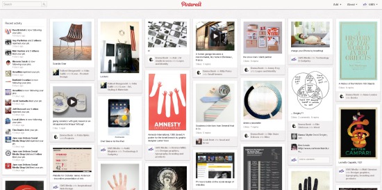 |
| the home page |
1. Simplicity.
The most striking thing about Pinterest is that the design is straightforward and simple.
Users can move between their profile, their home page (like a news feed of the pinners you follow, which also highlights any activity relating to your profile, like repinning) and the pins of a particular topic.
All of these areas look very much the same - the design anchors you to the experience of pinning and looking at others' pins.
In this way, the site is highly functional and doesn't distract from its main purpose.
Furthermore, the simplicity allows the experience of using the site to be very straightforward: navigation is all placed on the top bar, and on the home page, activity is highlighted in one place.
In this way, it mirrors Twitter's desire to be functional and streamlined, though the simplicity of Pinterest makes Twitter look over-complicated by comparison!
Changes to the layout of users' profiles has broken up the repetition of layout across the site, and the more collected approach to presenting the profile makes it look a little more formal which might not quite sit as well with personal users of the site, but feels very appropriate to business users.
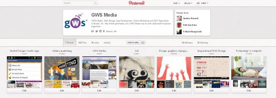 |
| profile page |
2. Modesty.
Pinterest's clear and functional approach to design is almost self-effacing and invisible.
It's quite striking the degree to which the site is not overly branded (though perhaps this makes the presence of the logo that much more effective).
The absence of colour or overtly designed elements really highlights the content, which makes sense given the importance of the visual to pinning.
Design elements that have been introduced are highly functional (like the 'scroll to the top' feature) and don't draw attention to themselves, and therefore away from the content.
This is probably the most striking innovation in terms of web design, and something that could be very interesting as an influence more generally, alongside the streamlining of navigation and greater use of space within the frame of the home page.
It's telling that the two most prominent sites that aim to provide a 'Pinterest for men' follow this model of design too.
Both Gentlemint and Manteresting feature an absence of colour, so as to highlight content, but both feel somehow less streamlined than Pinterest, which might have something to do with their more elaborate logos.
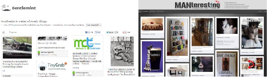 |
| Gentlemint & Manteresting |
 |
| visual emphasis in design |
3. Interaction.
In sympathy with this approach of simplicity and modesty, the interactive side of Pinterest - its main feature after all - is both easy and non-invasive.
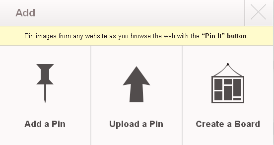
Pinning is made straightforward through the 'Pin It' button that can be installed onto your bookmark toolbar, or via the site.
Clicking on 'Add+' at the top of the page allows you to pin content (via the web or uploading your own files) and the various options are communicated with strong visual emphasis.
The other way to interact with the site is to repin others' content. Unlike Facebook's very direct and repetitive calls to action, Pinterest has a more subtle approach, which again foregrounds the visual content.
The options to repin, like or comment on a pin only appear when the mouse hovers over the image, meaning that the visual content is not disrupted by their continuous presence.
In this way, calls to action are easily accessible without being invasive.
Now it's your turn!
What do you think of the design of Pinterest? Does the design encourage you to use it?
If you have a Pinterest profile, please share a link to it in the comments below.