As we noted in our opening post of this series, university websites have to deal with a large range of visitors and a large amount of content.
Becuase of these two factors, the home page needs to strike a delicate balance of functionality and attraction: enough content to be interesting, but not so much so that the visitor will be overwhelmed; and a user-friendly layout that accomodates first time visitors and regular users alike.
On top of this, the home page (like that of any website) has to efficiently communicate the kind of institution the university is (or would like to appear to be).
This in itself is a tricky objective, as universities combine a range of roles (education, business, community, etc.).
Here are three main areas we think are most important to the design of the home page:
1. Communication: reflect the way you want the institution to be perceived
First and foremost, is the immediate impact of the home page.
As with any other home page, this needs to communicate what a business is about.
For a university, this means impressing potential students, academics, researchers and businesses with the core ethos of the institution.
For most, this means choosing whether they want to be primarily recognised for:
i. Cutting-edge research
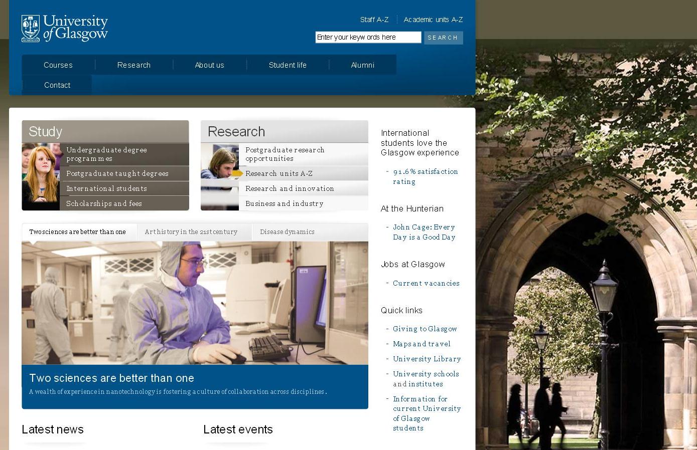 |
Glasgow captures the cutting-edge nature of its research (all three items in its banner display are related to research) and also hints at tradition in the background, which displays a traditional university scene.
ii. The history or traditional reputation of the university
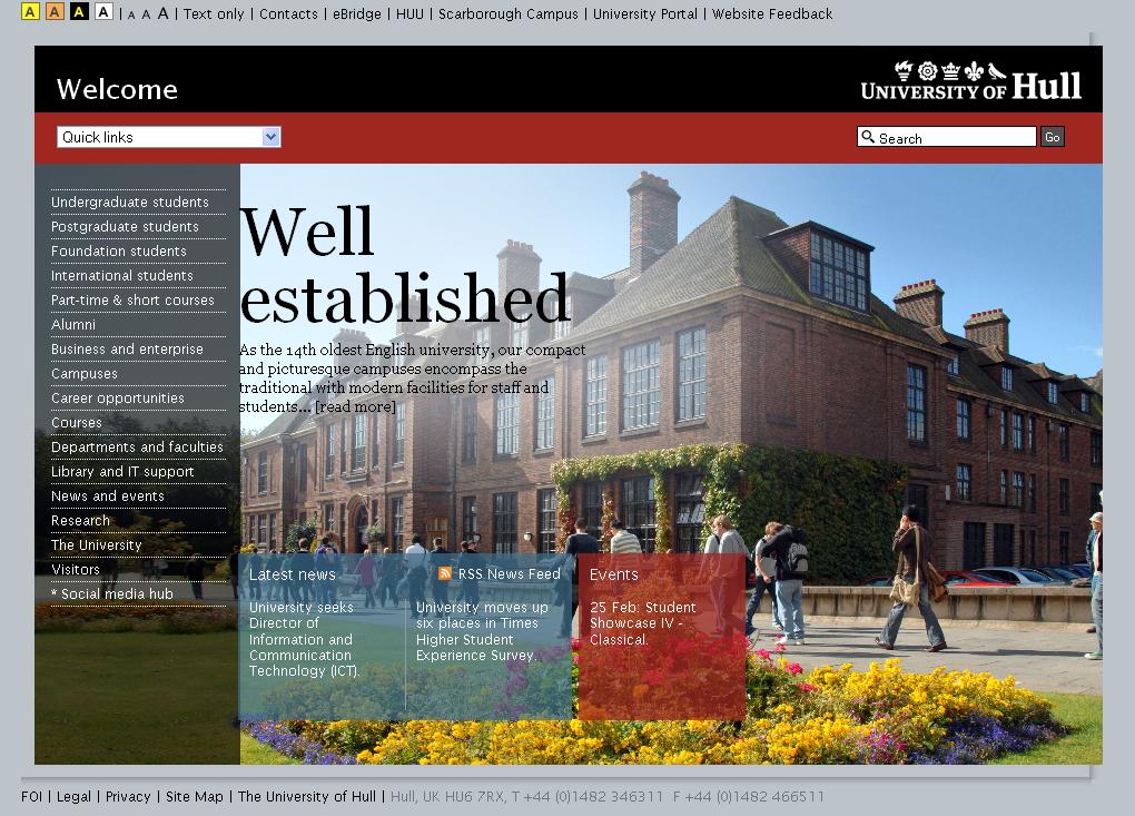
This home page is centred around the University of Hull's history through the dominant image of the old university building.
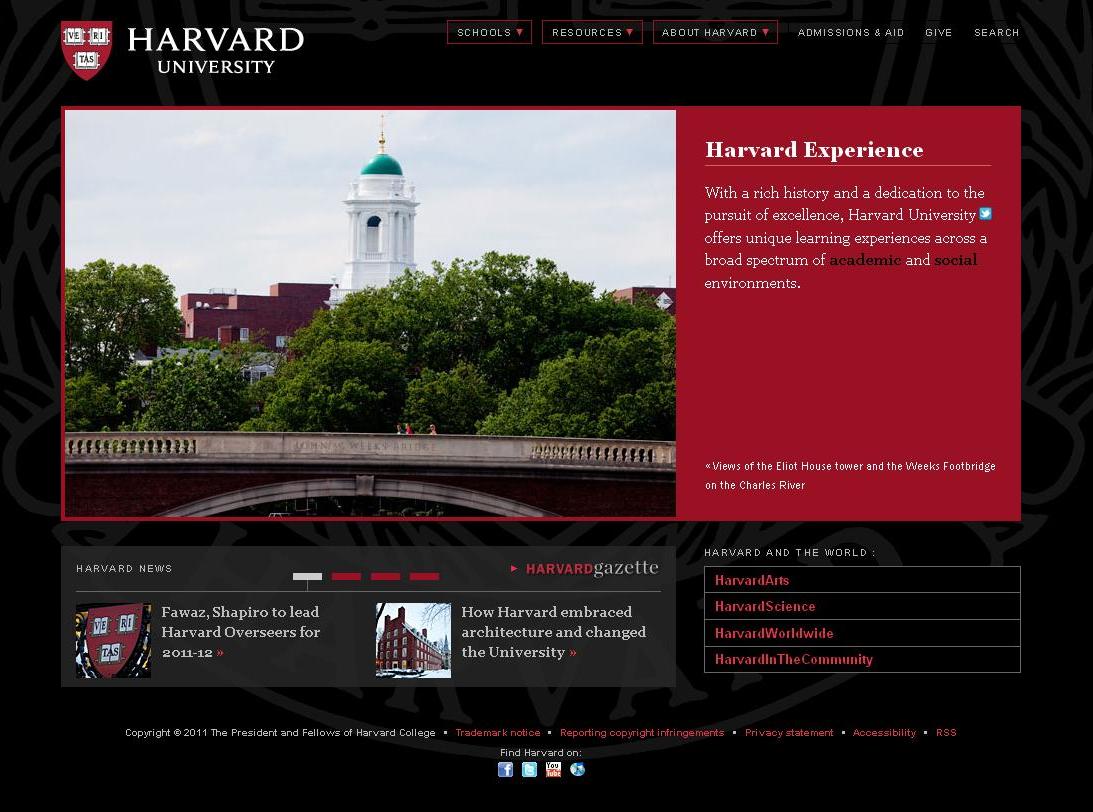
Perhaps unsurprisingly, Harvard University is also eager to emphasise its traditional reputation; and the website secures this through its use of the university's colours in the design.
Interestingly enough, the design choices of the home pages of Oxford and Cambridge do not indicate a desire to base their appeal on tradition.
iii. Its influence in a global area, such as political debate
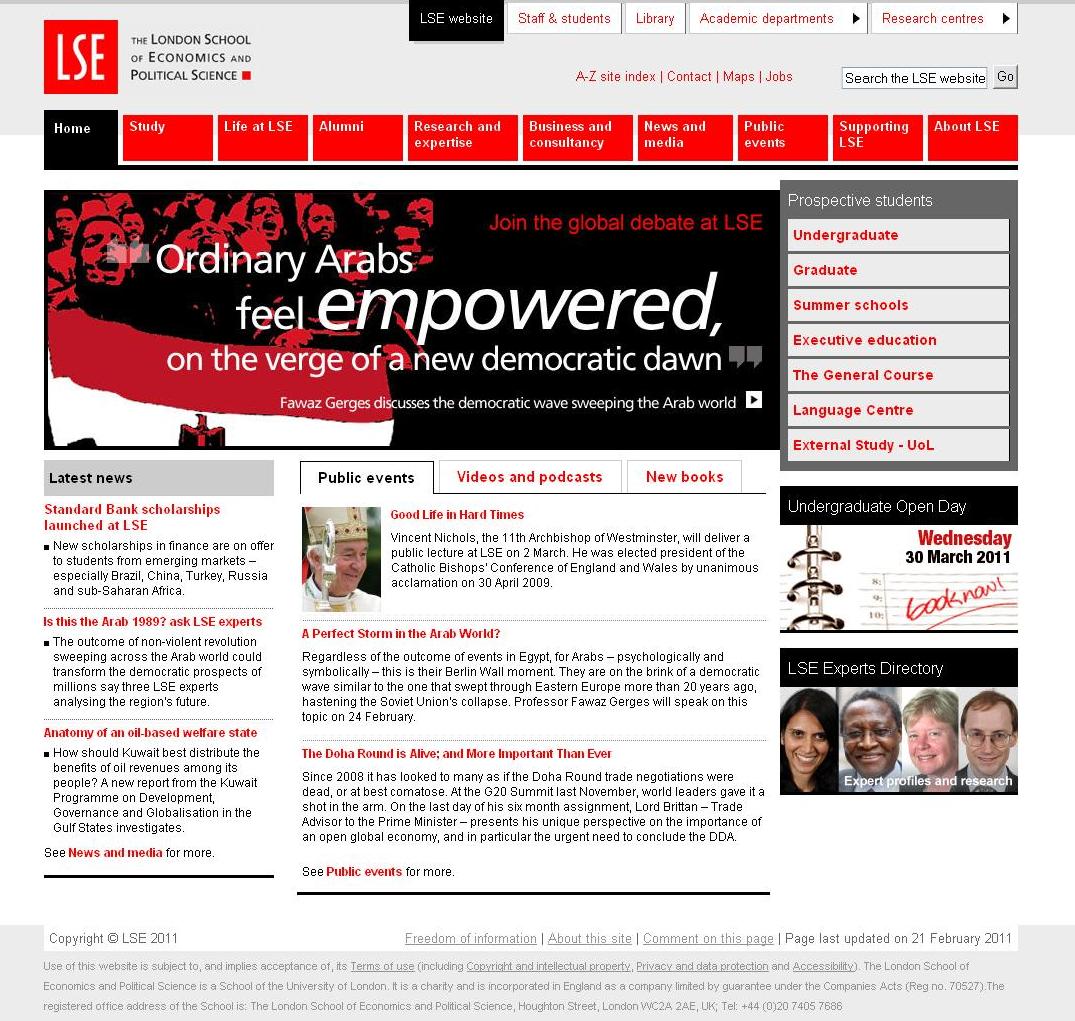
The striking use of a limited colour palette for LSE ensures visual impact, while the prominence of up-to-the-minute political news and debate make it seem highly relevant and dynamic.
iv. Its internationality
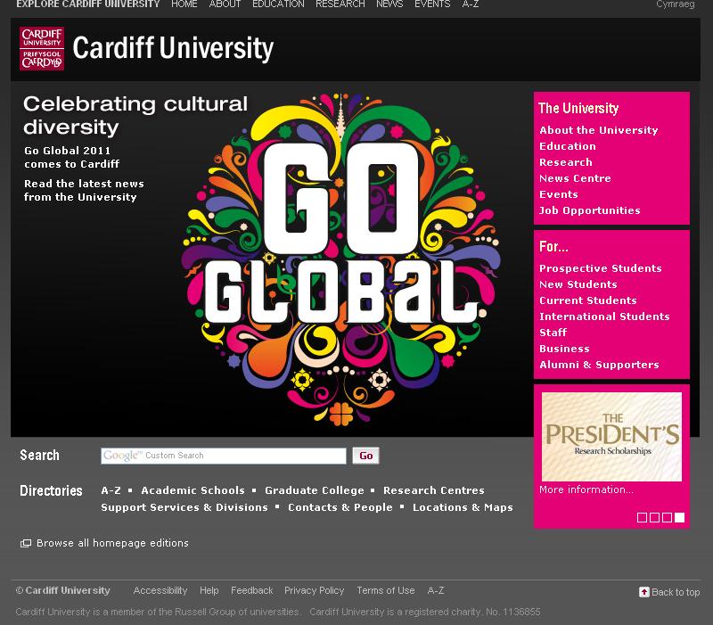
The home page of Cardiff University instantly displaces any regional specificity by the use of a strikingly colourful illustration which contrasts with the minimal presentation of the rest of the page, achieving maximum visual impact.
v. Its modernity
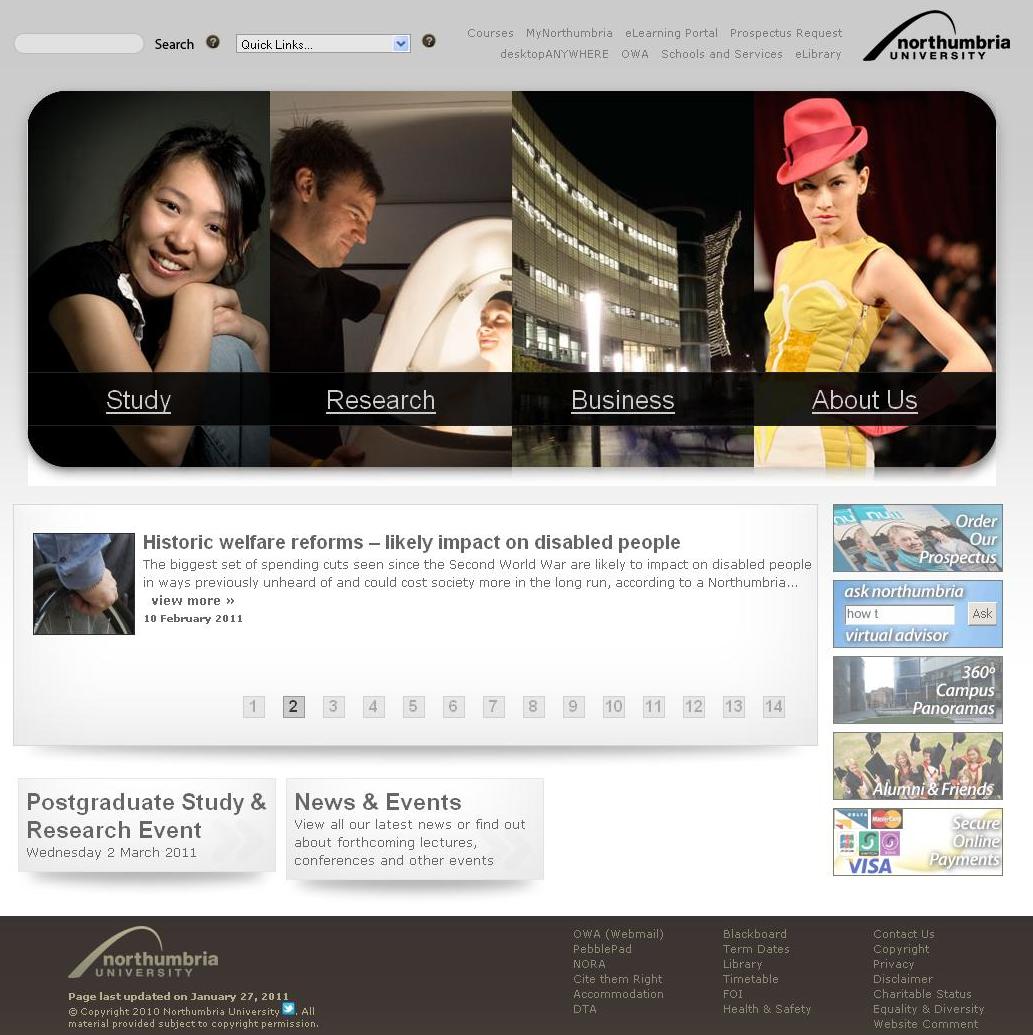
Northumbria University employs a minimal background with a dynamic and colourful navigation bar which dominates the page and displays images that address the importance of art and design to the university.
... or vi. Its setting
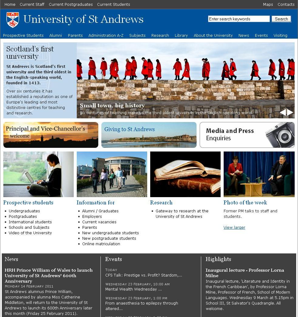
St Andrews celebrates its history as the oldest Scottish university, but more importantly places this in the context of the drama of its geographical setting.
Each of the several examples above has a clarity to its approach that indicates the university's particular appeal, achieved by the use of a central banner made of images and a minimal amount of text.
It is interesting to notice how these categories apply to most universities, and that often a range of them are using flash with a sequence of images to change the focus of each banner.
2. Content management: avoid overloading the homepage with text
As part of this effective communication, a univeristy website needs to deliver a lot of information, but in a way that supports the visual impact and therfore doesn't overload the home page with text.
All of the above examples manage to present snippets of information that are graphically compartmentalised (using colour, layout or boxes) and so are slightly split up, and that can be accessed elsewhere, thus cutting down on the amount of text.
It seems that a main feature of a university home page is to direct a visitor further inside.
The home page needs a visual hook which will encourage the new visitor to explore at the same time as directing regular users efficiently to where they want to go, which brings us neatly to our next point:
3. Functionality: ease of navigation
As we've discussed, the sheer size of a university website presents its own problems; and the accessibility of its various areas is crucial for new and regular visitors alike.
In this respect, the layout and organisation of navigation are vital.
Here are some examples we thought have come up with good solutions to the difficulty of directing attention, making the various areas easier to pick out from one another:
The use of colour to separate the main areas of navigation in the UCL website makes the site easy to engage with and avoids confusion through fusiness.
In this way, the home page has immediate impact.
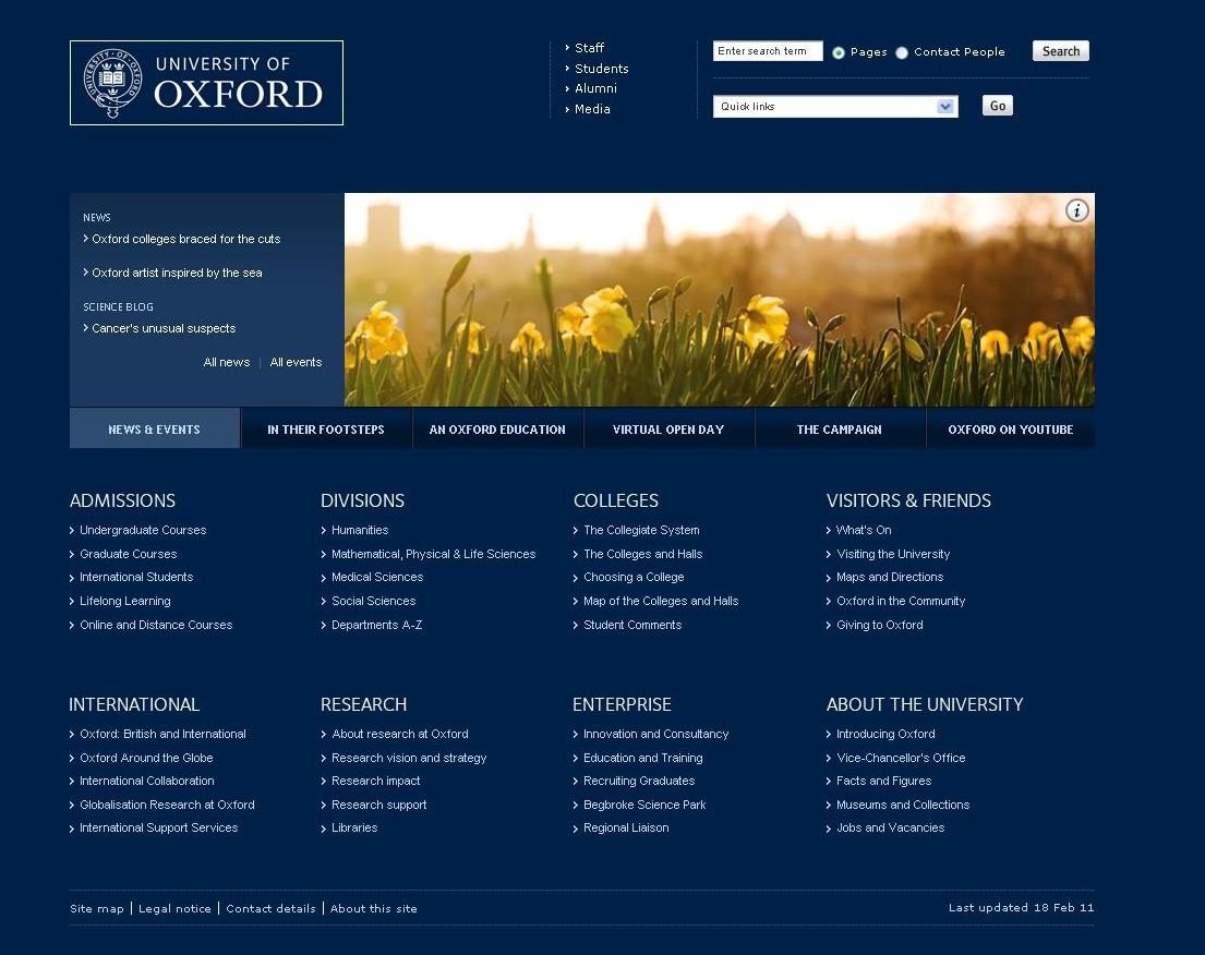
Oxford University adopts an opposite approach by making the whole page a uniform colour (Oxford blue, naturally) and giving a very clear map of all the different areas.
The one image that is used becomes more striking as a result.
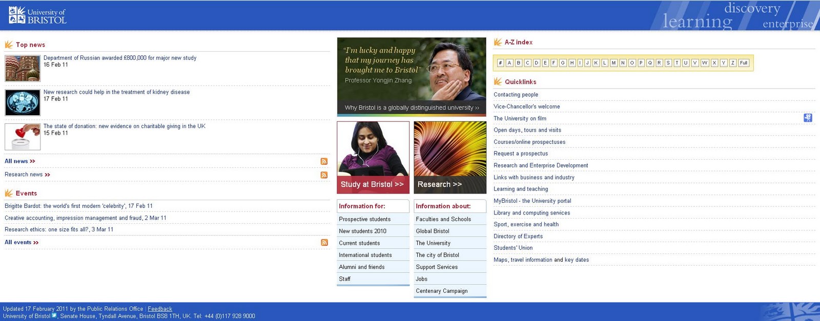
Bristol University uses a slightly different layout that places navigation to the side, broken up from the news at the other side with a central panel of images communicating key information about the institution (its internationality, for example).
The prominence of the A-Z bar at the top also indicates an approach geared to help the visitor find information.
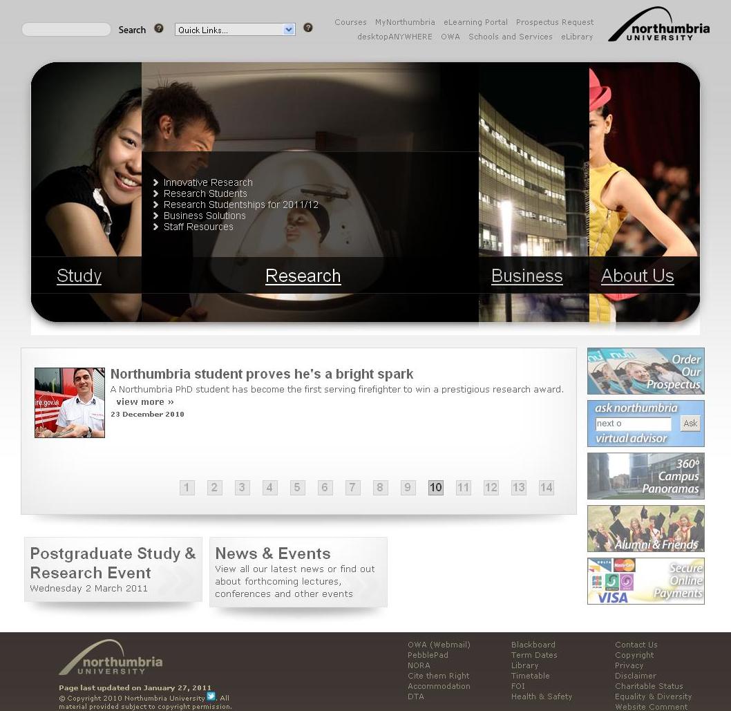
Northumbria's navigation is incorporated more into the components of the site's design, so that the overall sleekness of the page is not compromised.
Finally, an almost universal feature we noticed, that ties in with all three of these main points, is the dominant use of flash on the university home page.
The use of revolving images in a main banner enables each site to maintain a striking and attractive design, while incorporating extra content and a range of ideas into its brand image.
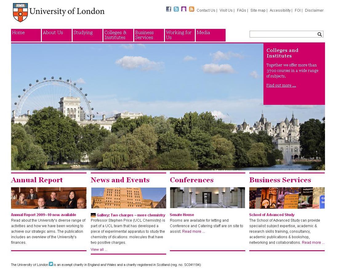
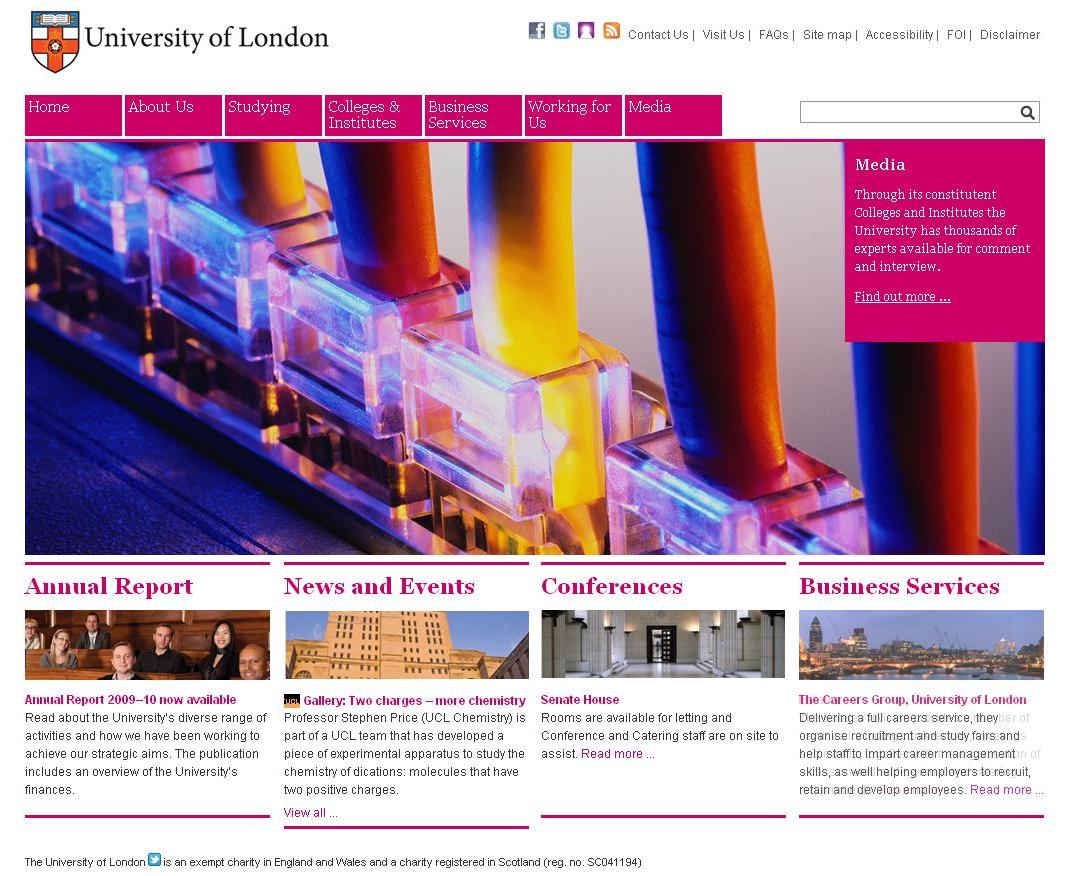
For example, the University of London transforms its site through the use of flash in an image that takes up over half the page.
Through this the site communicates its relationship to:
Tradition
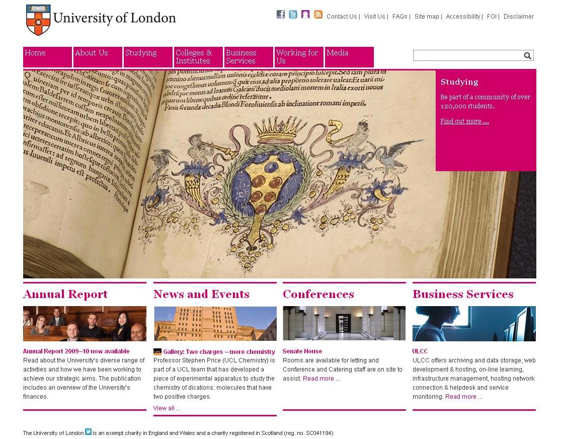
The dynamic location of London
... and...
Cutting-edge research in new technology.
If you have any further thoughts on any of these issues, or have seen a university home page that adds a new dimension to the areas we have been discussing, please do let us know in the comments below.
Our next post will venture inside the university website to broach the issue consistency and what strategies are used to make the various departments contained within offer a coherent design message.