For the final installment in our blog design & advice series, we want to look at some blogs we think are doing a great job in terms of design and layout.
We've chosen a range of blogs to feature, not just business-related ones, to demonstrate the variety of looks that can be achieved, and often using quite simple approaches.
Over the past few weeks we've looked at blog layout and the value of experimenting with various elements, as well as simplifying what you include.
We've looked at customising your blog, the importance of making it look unique and matching your branding, and also thinking about the way colour can guide a visitor's journey across the page.
And finally, we've looked at blog optimisation, and the way design can play a role in engaging visitors, making a blog more interactive and able to encourage return visits.
Taking our thoughts about design from those posts, we have a few examples taken from blogs we read regularly to look through:
The Next Web
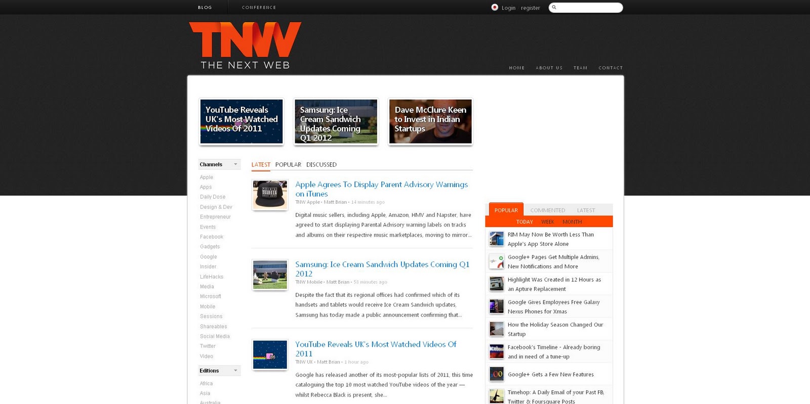
Befitting a blog which is about disseminating news on technology, business and culture, the design of the blog is fairly simple, and works to highlight the main stories.
This is done in a couple of ways.
Firstly, the most recent pieces of news are foregrounded at the top, using images which relay something of the posts' content.
Secondly, the heading of each post appears in a bright blue, a colour which isn't used anywhere else on the page, making it stand out more.
Other elements of navigation are placed in the background, so as not to be distracting.
It also places emphasis on the sheer volume of content, with each post receiving only a snippet of information under the headline, in order to maximise the number of posts on a page.
Visitors are then directed to ways they can filter the posts, either through popularity/interaction with the box on the right (again, colour draws the eye to this area), or for a more specialised visit through the channels on the side, which feature less prominently.
Amy Porterfield
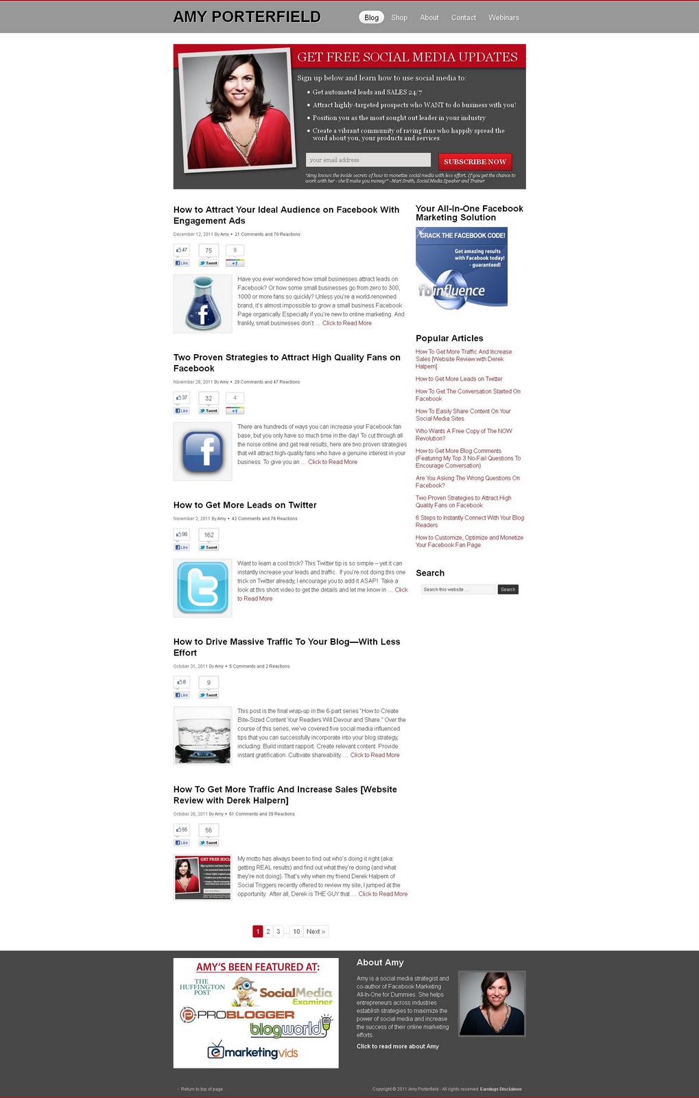
Amy Porterfield's blog is very straightforward and to the point.
There are no bells and whistles, just an emphasis on content and encouraging visitor engagement.
The look of the blog is uncluttered - in terms of extras there is a list of popular posts and a link to Facebook, rather than lists of subjects & archives of posts - and consistent.
The posts are arranged in the same ways, with the same features (the opportunity to share, number of comments and reactions) presented at the top of each one.
The look therefore reflects the specificity of the blog's content - it's all on the same subject, so no need for lengthy subject lists - and encouragement of interaction - emphasis is placed on comments and; reactions by placing them this close to the heading of each post.
It's also worth looking at the language and tone of the content, for ideas on ways to encourage visitor interaction.
Brain Wads
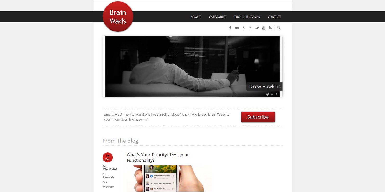
Another marketing blog, which makes use of visual repetition to guide the visitor, particularly in the very restrained use of colour - here red is used effectively to point out important areas to the visitor (highlighting the subscription and each individual post).
Another thing worth considering is the way calls to action are foregrounded - not only is the subscription link in red, but it's placed right at the top, before you get to any posts, and away from any other messages the blog might be communicating.
The navigation, both within the blog and away from it to other social media channels, is placed at the top (where we would commonly expect it to be on other websites) and made as straightforward as possible.
The Fox is Black
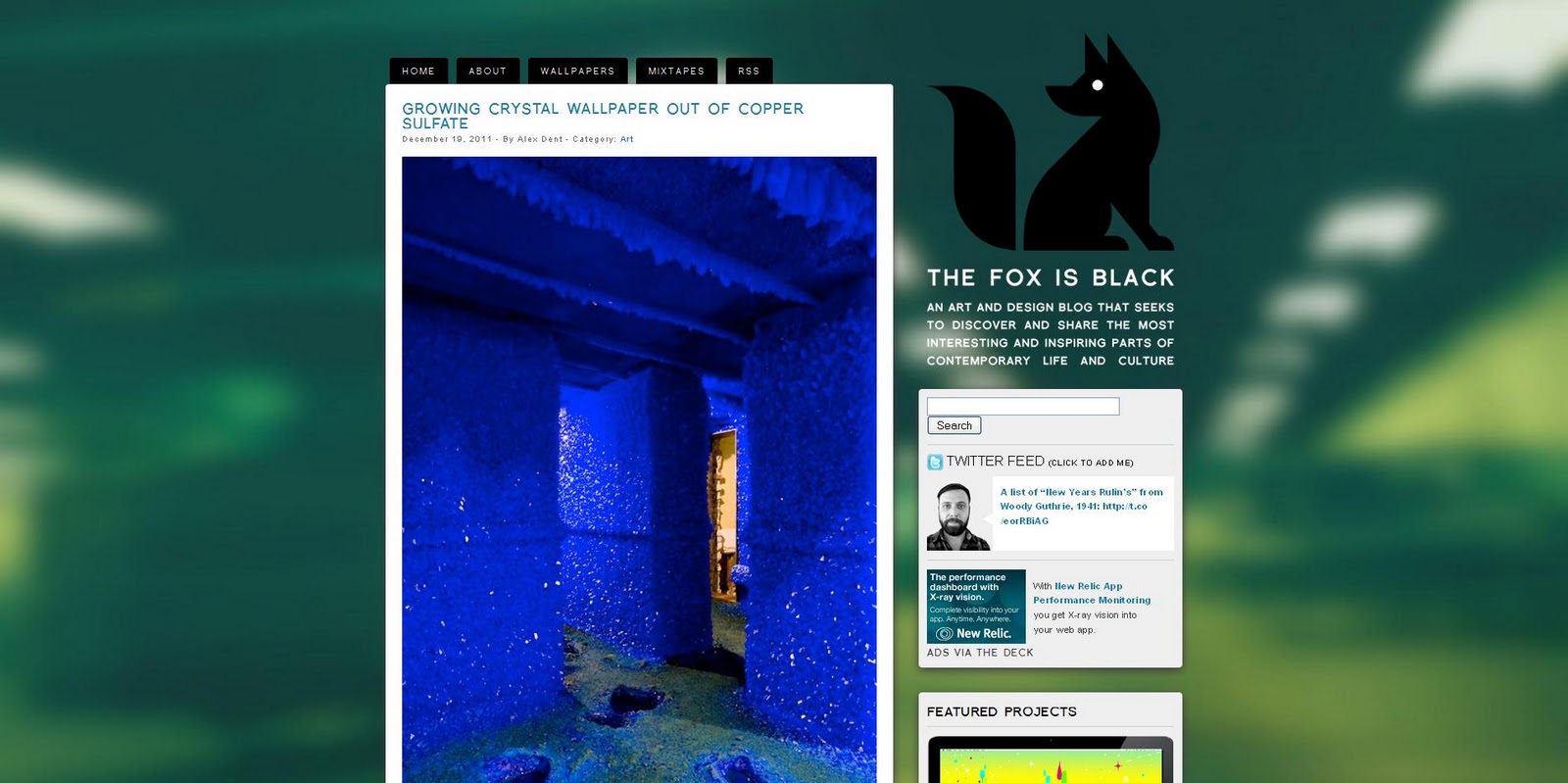
From a rather different direction, this design blog also places an emphasis on simplicity, creating well-defined areas for the posts and other elements of interaction and information on the right (which are also stripped down to the bare necessities).
Appropriately to its interest in design, visual elements are played up - noticeably, the background is not white here, but white is used to box off the various elements in contrast to the blurred out background - and the posts are dominated by images, meaning that they take up a lot more space than in previous examples.
But this approach brings visual elements to the fore, and places an emphasis on scrolling through posts, making it a different kind of visitor journey, one where the variety of design and culture featured can be enjoyed in one sitting.
Brain Pickings
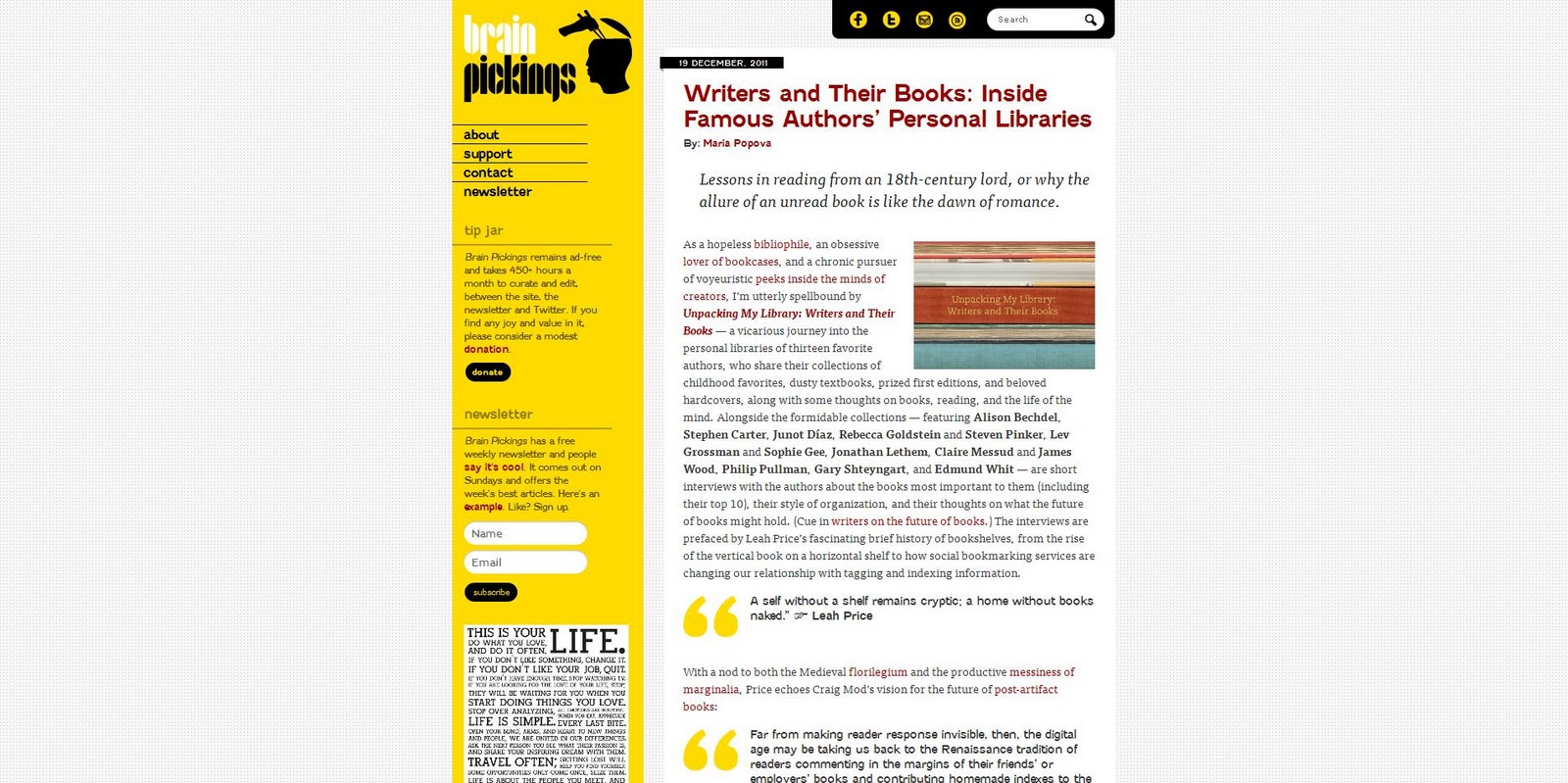
Another blog which focuses on culture and design, and so places more emphasis on imagery, Brain Pickings also uses colour to direct the eye and compartmentalise information.
Bright yellow is used very effectively to capture the 'about' information, so all archives & blog information are placed in the yellow bar to the left, while links to social media sites are highlighted with the same colour at the top of the blog.
It also adds a splash of visual excitement, without being overwhelming.
Because the blog covers a variety of areas, the inclusion of a subject cloud works well to entice a deeper visit on a particular subject, as does the prompt to visit further posts at the end of each post.
We hope you've found our look at blog design interesting, and that our tips and advice over the past few weeks has proven useful.
We'd love to see more great blog design, so if you want to share your blog with us, please provide a link in the comments below.