Previously on the blog, we've looked at the design of green websites and University websites, focusing on those important elements of their design which make for an outstanding website in their area.
In this series of blog posts, we're going to look at clothing websites, the themes involved in these types of ecommerce websites, and why these design techniques work.
To begin with, we'll look at the home page and product pages.
Home Page Appearance
The most striking design element of clothing websites is often the colour scheme.
Colour in any website is very important to the initial feel of the site, and what is being communicating to your customers.
It also has an important part to play in the functionality and clarity of a site.
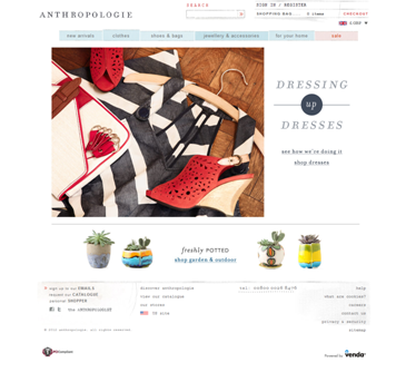
Not all clothing sites follow the same colour scheme, but a significant proportion opts for a white background.
This helps the images stand out, and gives the website a clean, fresh look without the risk of a colour scheme that may go out of fashion.
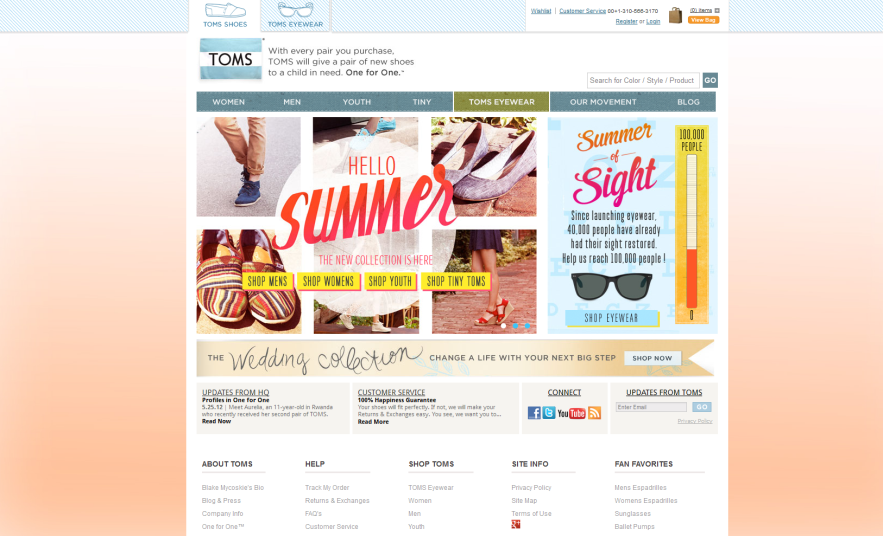
The TOMS website is a good example, using a denim and seamed texture design in their top navigation bar.
This links the style of the sites homepage to its products as well as adding a nice eye-catching but subtle detail.
Showcasing the product
The home page of clothing sites is generally quite different from the inner pages, which aim to showcase their product rather than their brand.
On websites for more established clothing companies, showcasing the brand is usually the key focus on the homepage.
These product pages allow customers to scroll through general categories of clothing types and click through to see the product in more detail along with product information and price.
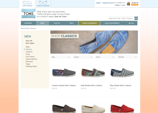
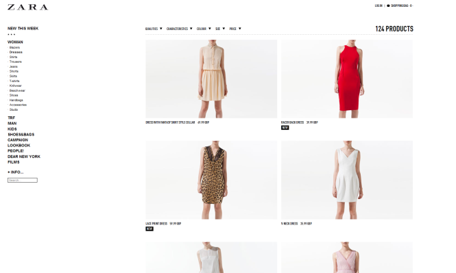
TOMS and Zara both take a very clear, direct approach - here, the white background shows off the product, achieving accessibility without distraction, keeping a certain amount of stylishness.
Product pages are incredibly important for any ecommerce site.
While the homepage can communicate more about the brand as a whole, product pages, whether you're selling DIY equipment or shoes, need to show off the product to its best advantage and large clear pictures, with a zoom capability if possible, are the best way to do this.
It's also good to think about how people use the product.
Zara presents clothes on a person to enable customers to see what kind of fit a garment is, whilst some sites also tend to show clothes on a model or person with the face not visible, to avoid distracting from the clothes themselves.
Would your product benefit from being presented next to a person or something else in order to give a sense of scale?
Next week, we'll carry on looking at clothing websites, focusing on navigation and branding more generally, as well as the way interactivity is used.
If you've seen any good clothing websites that you think we should take a look at, let us know!