
Last week we looked at the design of Facebook, and in particular what elements businesses could potentially draw on to encourage the degree of engagement and interaction that Facebook's design demands.
Today we will turn to Twitter to ask similar questions of how the branding and design works, and see if we can make connections between design decisions and website goals.
In some ways, it might be easy to claim that Twitter's design isn't that important - the site provides a very straightforward service; users post short updates which are seen by anyone who follows them.
However, even the description of Twitter as a 'microblogging' site belies the extent to which the site facilitates highly engaged and diverse conversations.
It is not simply somewhere where thoughts are thrown out into the ether, but a place to communicate: to listen, talk and discuss.
In this way, the relative simplicity of the design is somewhat misleading and also highly informative.
1. Continuity.
In our post on Facebook, we discussed the changing design of that social network, which has seen some quite dramatic revisions to profiles and general functionality over the years.
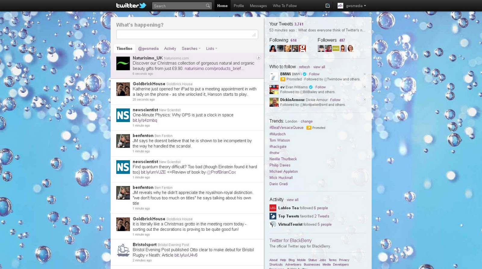
In contrast, Twitter has remained very similar in its layout and design from the beginning.
There has always been a news feed and a profile page.
Over the past couple of years there have been some changes to allow users easier access to information about how others are engaging with them (the addition of tabs within the news feed, recording mentions and information about retweets - this has been modified this week, with the addition of an 'activity' section which records actions by those you follow) and additional information about trends, followers etc. placed in the right hand bar.
However, the page you log into has remained fairly consistent, which means the site retains focus on its key purpose: sharing and communicating with others.
Twitter has resisted the urge to change this process (unlike Facebook's increased compartmentalisation of news) so that the site itself is not distracting users from this primary goal, or making them go through more steps than is needed.
Allowing continuity through design and layout keeps the site (and its users) focused on its purpose.
2. Simplicity.
The continuity of Twitter's design is matched by how straightforward it is.
The site is laid out in a familiar fashion: navigation is placed on horizontal axes and information on the vertical, much like other websites.
There are no elements of the layout that aren't functional - can you say the same of your website?
The unfussiness of the design - the feeling that it isn't designed, as such - means Twitter's features are clear in their purpose and ultimately retain the feeling of a service, and what's more, one that isn't trying to do everything at once.
Twitter isn't demanding anything of its users (the only question it asks 'What's Happening?' is much more easy going than the active language of Facebook): it's about what you put in, and the reduction of extra noise makes it easier for users to want to engage.
3. Customisation.
The reason Twitter retains its simplicity and continuity has a lot to do with the fact that to a great extent the look of the site is controlled by its user.
The background image/colour and font colours can all be changed by the individual; this level of customization plays a major role in users' feelings of comfort and familiarity with the site - people share quite personal opinions through the site, and this ability to make it theirs seems an important part of that sharing.
Despite this, the Twitter brand is still maintained, but rather unobtrusively, through the presence of the bird icon at the top of the page and perhaps more persistently in the language used (tweets, retweets etc).
The design communicates a self-confidence that doesn't feel overbearing - excessive branding / promotion can be very off-putting to users, especially when a site requires interaction (a useful rule to remember when engaging with social media for your business).
What do you think?
These are just some of our thoughts on the design of Twitter - we'd love to hear more about what you think of it and what businesses can learn, so please let us know in the comments below, on Facebook or on Twitter.
Do you use Twitter for your business?
Share your Twitter name in the comments below.
Continue to Part Four: Website Design: Google Plus for Business