So far we've featured discussions on the design of social media networks Facebook and Twitter, thinking about what elements of their design are geared to aid interaction and engagement (the chief principles of social networking).
This week we're turning to the new kid on the block: Google Plus.
How does Google Plus fit in with the other more established social media sites, and what sets it apart in terms of design?
While it is relatively early days for this site, its newness doesn't put it at a significant disadvantage in comparison to the longevity of Facebook and Twitter in terms of usability.
It seems that for all social networks you have to learn a new language and how to use it correctly (retweets, likes etc) and Google Plus is no exception, so as well as thinking about how the site encourages engagement, we will be thinking bout how the design works to orient users to a relatively new experience, bringing together novelty and familiarity through design details.
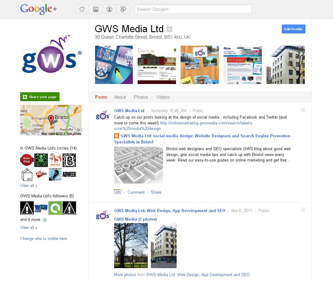 |
| A profile page |
1. Layout.
This is the key to generating familiarity for users.
The layout of Google Plus conforms to the kind of navigation we are used to on the web, and more significantly the layout that we are used to seeing on Facebook.
Navigation on Google Plus is similarly blocky, with a top strip which takes you to your profile, your stream, your photos and your circles as well as the search feature.
Other information (who is in your circles links to hangouts) is placed on the left and right for your stream photos and profile pages.
The main place where this layout is modified in in the circles page, where the navigation splits into vertical, rather than horizontal, layers.
This allows interaction between the layers in a more fun and visually exciting way, and it is unsurprising that the circles feature is the most dynamic (for example, circles expand to show icons of their members when you hover a mouse of them), as this is the main innovation of the Google Plus profile (in addition to the hangout system which enables live chat).
By making this feature highly functional and easy to use (you can add and remove friends or contacts into more specific groups with a drag of the mouse) and visually exciting (you drag icons into circles which then spin around within it) the user is drawn to play with and take advantage of the feature.
It's worth asking, how are you encouraging user interaction on your website?
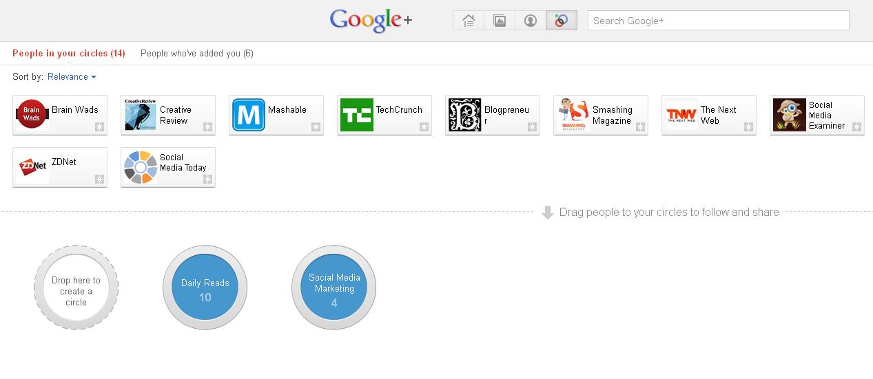 |
| The Circles page |
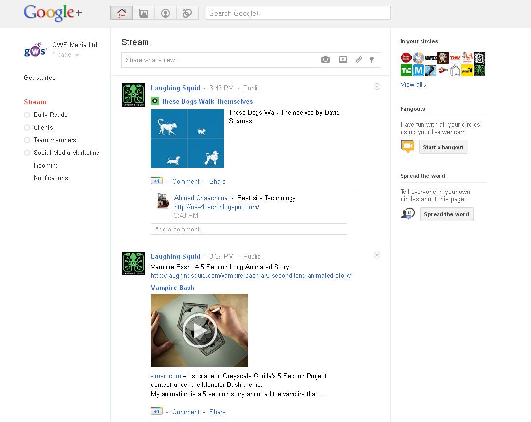 |
| The 'Stream' |
2. Colour / white space
Another aspect that helps the site feel familiar is the use of colour and white space - consistent with everyone's experience of using Google as a search engine.
In this way, Google Plus is highly consistent with the branding of Google as a whole. The whiteness of the page also differentiates the site from Facebook, as it keeps the stream / profile pages feeling uncluttered (which in Facebook looks busy in comparison).
Colour (the colours of the Google logo - blue, red, yellow and green) is used to accent the design of the page, added to icons you hover the mouse over or to button links which might need actioning (edit profile, upload photos etc.).
In this way, the user's eye is drawn to action point and to other important areas as the mouse moves around the page.
Could you be using a specific colour palette to more effectively prompt user navigation and interaction on your own website?
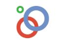 |
| Circles icon |
3. Iconography.
As we mentioned, one element of using a social media site is learning a new vocabulary.
Google Plus has various features that are new elements, specific to it ('Stream' as opposed to Facebook's 'wall' and 'circles', 'hangouts' etc.).
This new terminology could be confusing (or even alienating, making users reluctant to join), so Google Plus attempts to counteract this with use of clear and consistent icons, such as circles for the circle feature, a camera image to upload photos and so on.
Combined with familiarity of layout, the icons (which are also labelled when a mouse hovers over them) reduce the amount of text and clutter on the page, working on our visual memory, sparked by our acquaintance with the straightforward images used for icons.
In this way, Google Plus harnesses the very visual nature of website design to offer a social media network that takes into account user experience with social media as well as people's hunger for novelty, distinguishing itself from existing, powerful brands.
Only time will tell if they manage to retain this uncluttered feeling and elegant design.
What do you think?
These are just some of our thoughts on the design of Google Plus.
We'd love to hear more about your experiences of using it, so please let us know in the comments below, on Facebook, Twitter or on the new GWS Media Google Plus page.
Have you set up a Google Plus page for your business?
Share the link in the comments below.
Continue to Part Five: Social Media Website Design - What Businesses Can Learn