
Over the past several weeks we've been looking at the design of social media sites, focusing on Facebook, Twitter and Google Plus and thinking about how their design elements encourage engagement and interaction.
To conclude the series, we're going to think more specifically about how design strategies used by these sites could be used by business websites.
Next week we will be looking at the design of Google's blogger platform, including some practical advice on customisation and layout, so these points will filter into that too.
Visual Experience
Social media sites take advantage of the web as a visual medium, not only in the kind of content shared (photos and videos are much more likely to be shared) but in the look of the sites themselves, drawing users into interaction with the design.
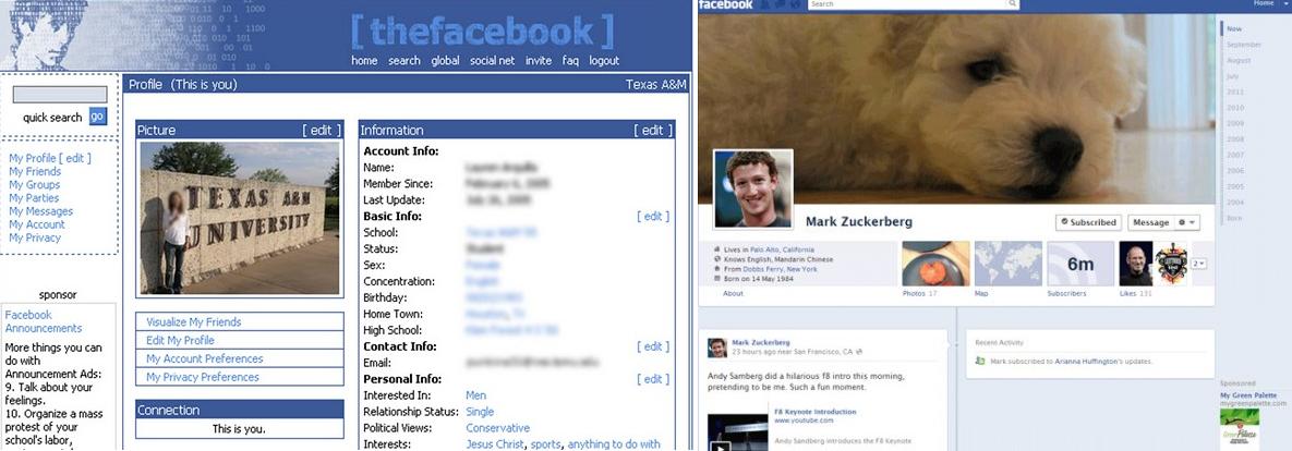 |
| Facebook: Past (left) & Future (right) |
1. Continuity of design is very important to usability & interaction.
Facebook showed us that maintaining a visual consistency, so that even if the layout has changed, your site looks like your site, is key.
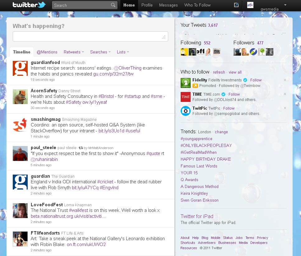
Consistency of branding (through colour - Facebook - or strong icons - Twitter) and the general look is important to the ease of user experience and retaining your audience.
2. Continuity through design and layout keeps the site (and its users) focused on its purpose.
Twitter's consistency of design communicates its self-confidence and security in what it's service is - excessive branding / promotion can be off-putting and distracting to visitors.
3. Visual excitement encourages interaction.
Google Plus uses elements like animation and colour to make the site visually exciting, encouraging the user to play with and take advantage of its range of features.
Simplicity
One common element we noticed in relation to these sites is the importance of keeping design simple, in both layout and the look of the site.
1. Clear navigation is the key to any effective website.
Facebook, Twitter and Google Plus use very similar layouts to those used by the majority of websites, with the familiarity of both horizontal and vertical navigation bars.
For all three the navigation is similarly blocky, with a top strip which takes you to your profile & your news feed, as well as the search feature.
Navigation splits up the different streams of information so that it is easy to access and move between types of news (whether it is general or specific to you).
2. Clean design places the functionality of your site in the foreground.
Twitter's design is kept minimal and there are no elements of the layout that aren't functional - the site itself is not distracting from its primary goal.
The whiteness of the Google Plus page keeps the stream/profile pages feeling uncluttered, focusing attention on the points of interaction.
By avoiding users having to go through more steps than is needed it makes it easier for them to navigate, engage and participate.
Increasing Interaction
Putting the visual experience to the fore and maintaining simplicity both help to increase interaction, but there are other things we noted that are designed with this aim in mind.
1. Interaction can be made incredibly easy.
The clean design and straightforward navigation of all 3 sites makes interaction easy; reducing the steps that need to be taken between the action you want and doing it, is a must.
Twitter is probably the most direct in this respect, as the design is based around the major function of sharing.
Websites need to be clear about what they are asking visitors to do and make it easy for them to do it.
2. Be direct.
Clarity of purpose can be supported by repetition.
Facebook uses active language to encourage participation.
All three sites repeat their calls to action constantly (actions - reply, retweet, like,share etc. - are repeated on every post).
3. Draw the Eye.
Coming back to the visual nature of web design, calls to action shouldn't all be language-based.
Google Plus users colour to draw the eye to action points and through the navigation.

What do you think?
We've looked at some of the main social networking sites.
Let us know if there are others you would like us to look at!